To support this evolution and highlight its distinctive positioning across its markets, Be Dandy refreshed Novaxia’s brand identity.
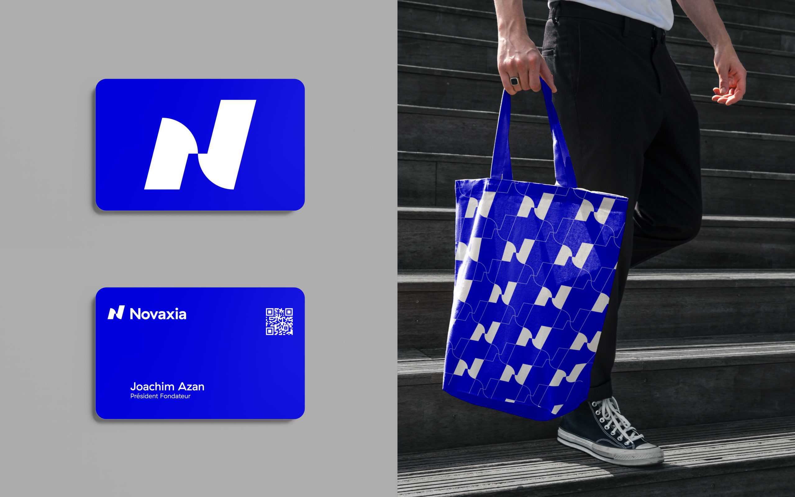
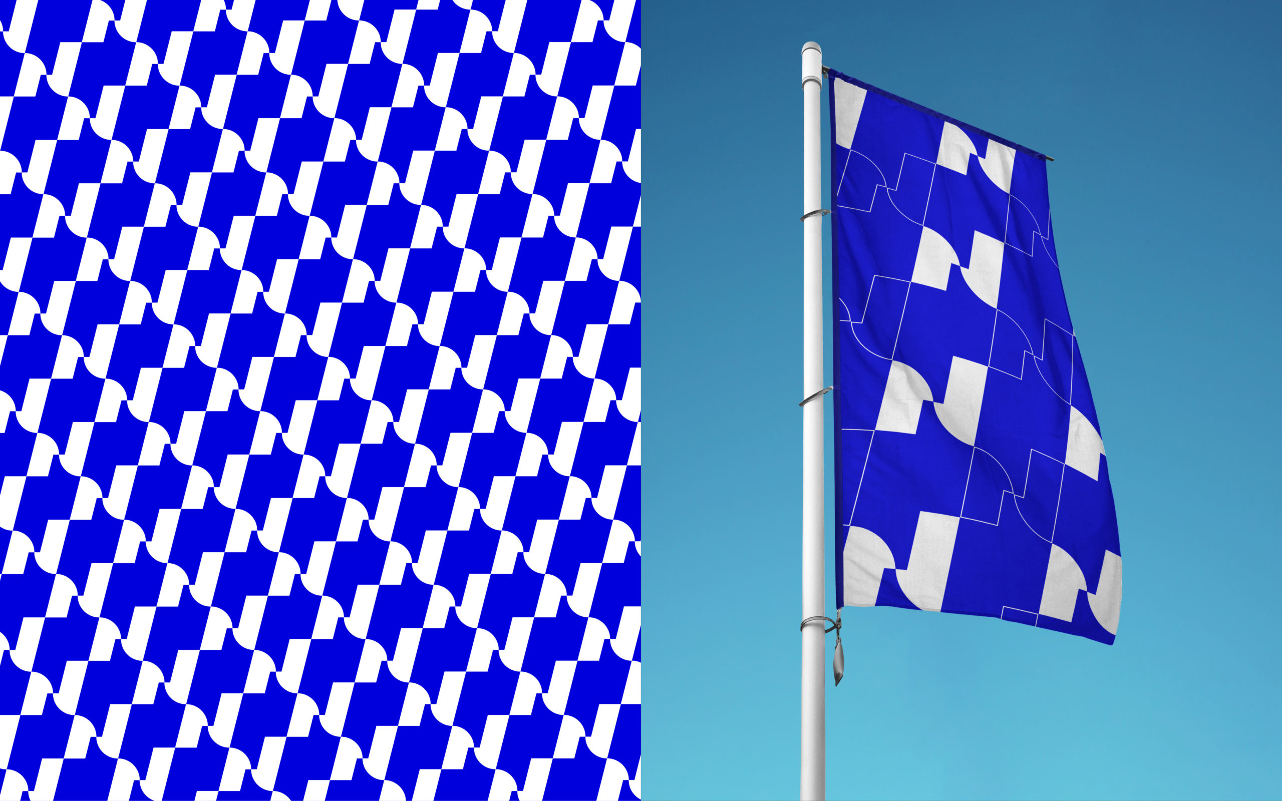
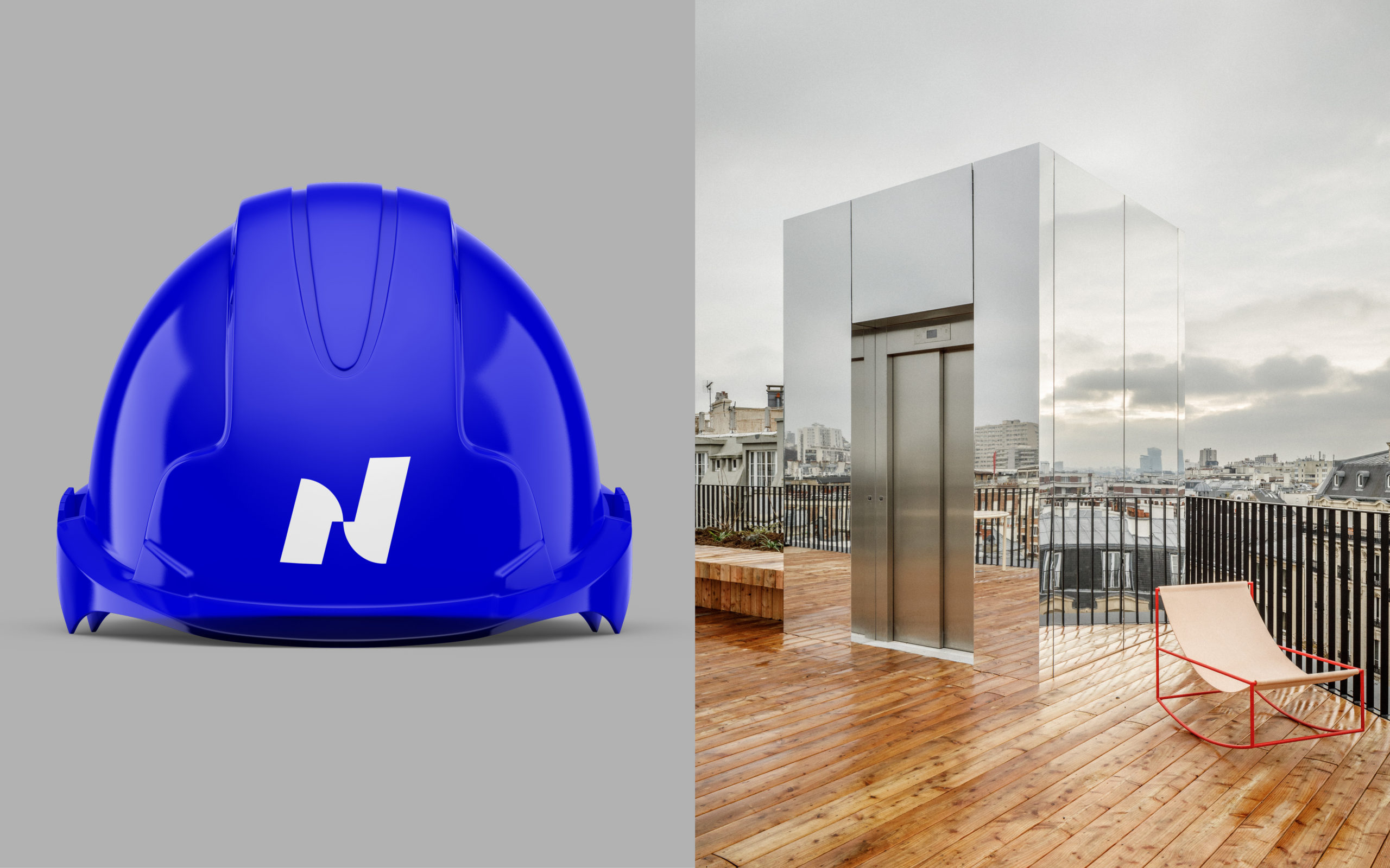
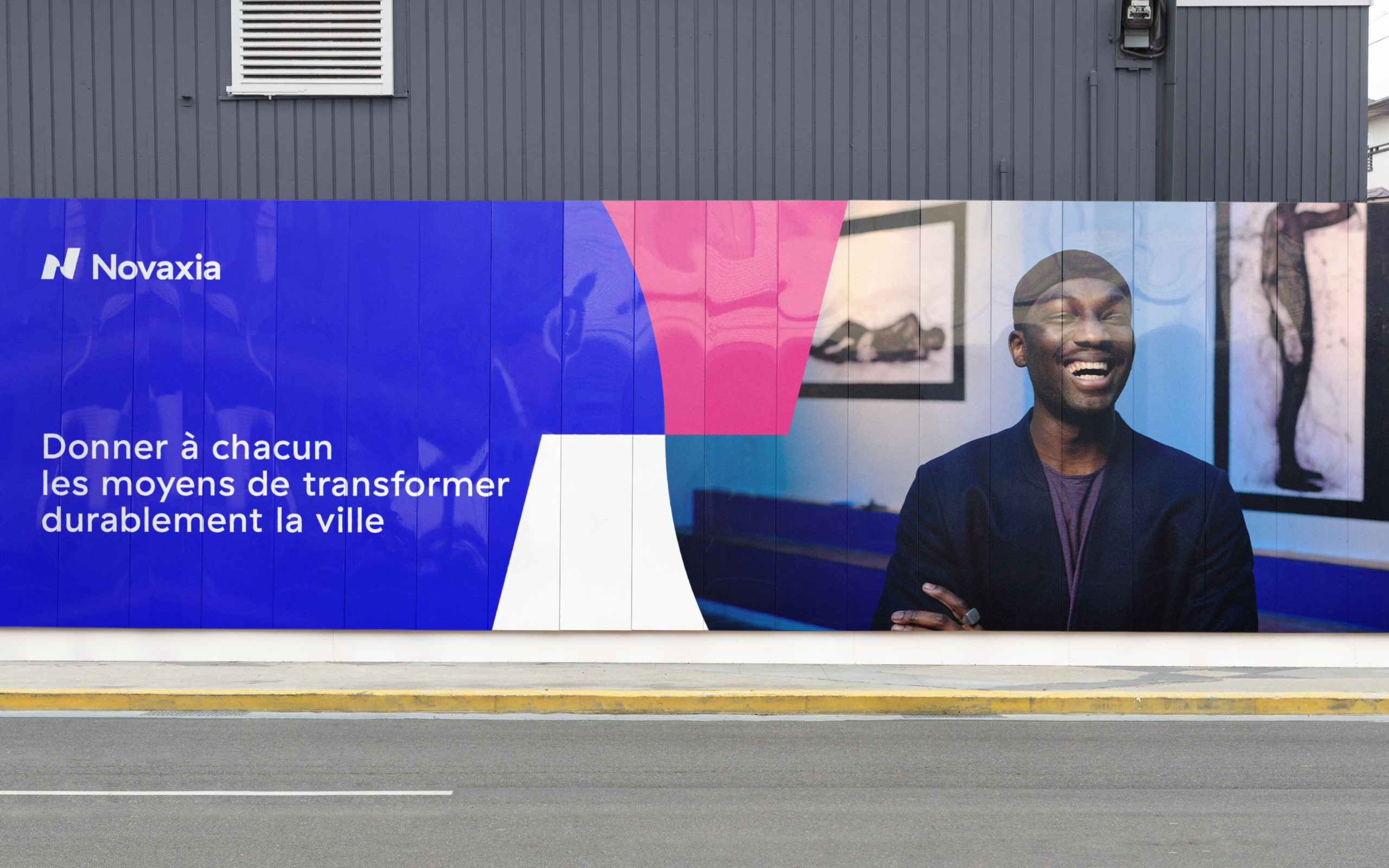
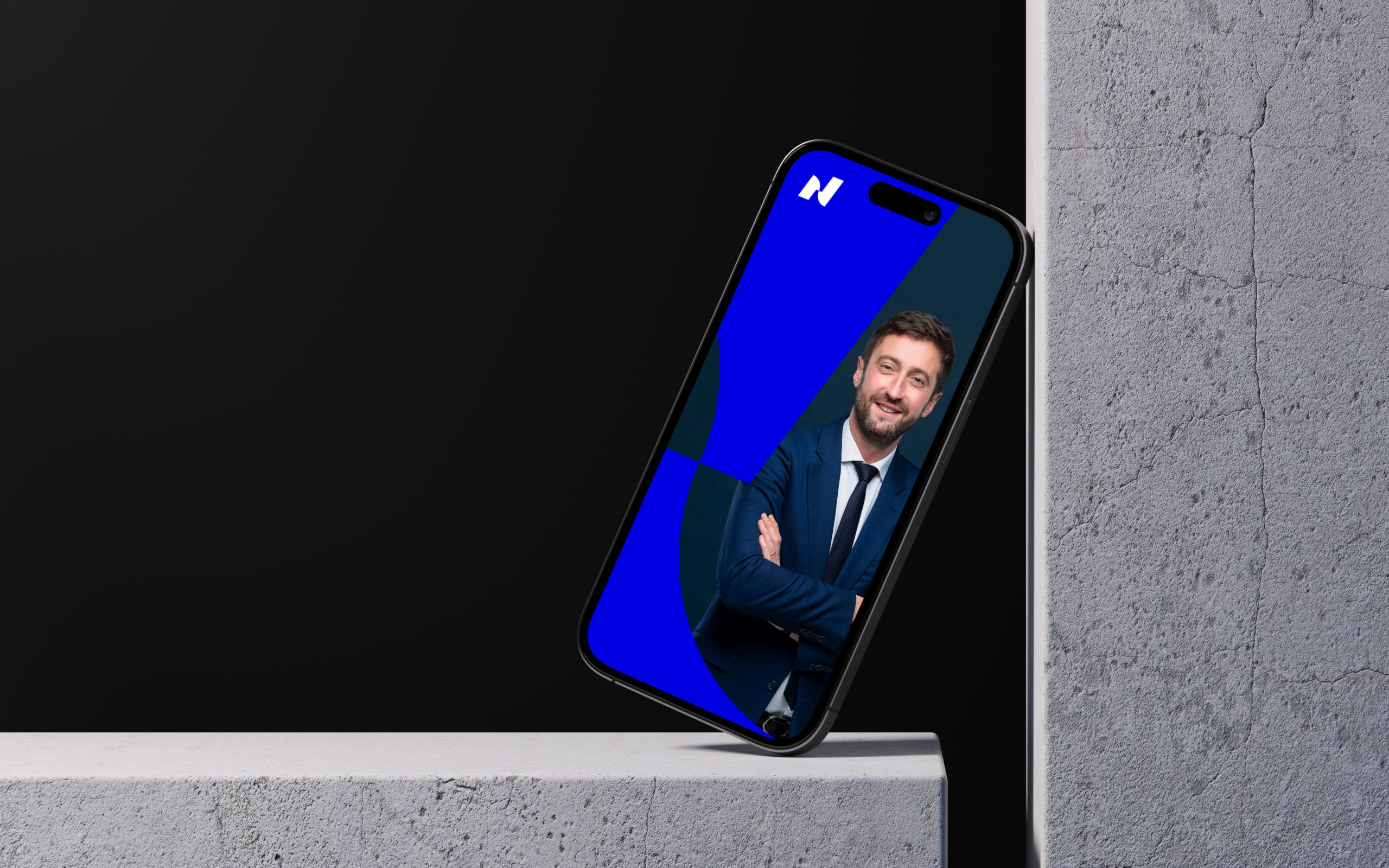
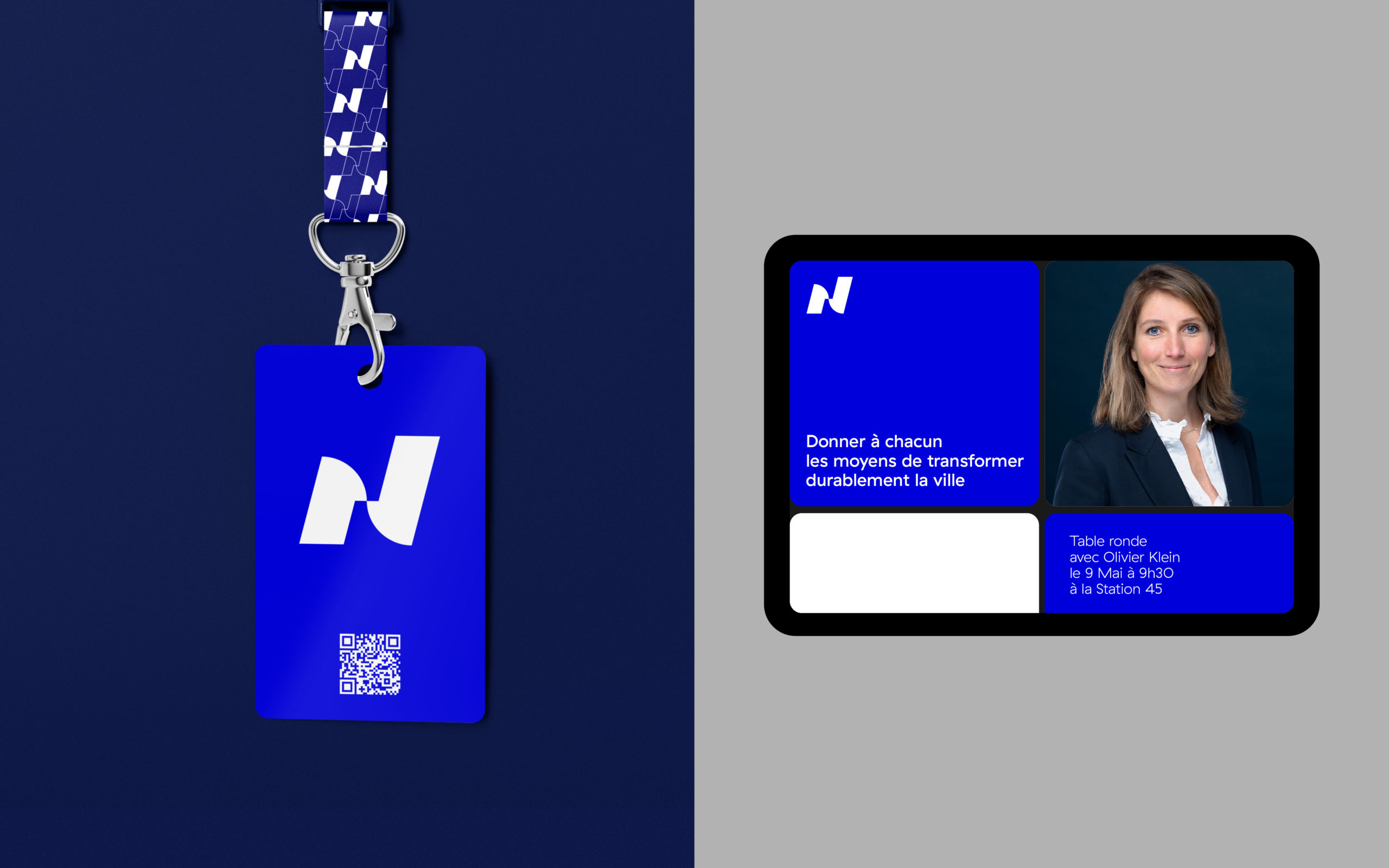
Already recognizable through its capital “N,” the lettermark has now evolved into a fully-fledged monogram – an instantly identifiable rallying sign for employees and partners alike. Its design combines soft curves, symbolizing humanity and agility, with sharp lines and forward-leaning diagonals that convey action and growth. At its center, a focal point represents collective unity, human connection, and impact – at the very heart of the group’s activity. Across the brand’s communication materials, the monogram is developed into a pattern that feeds a visual system blending rhythm, scale, and distinction. Whatever the topic, Novaxia’s communications combine shapes and imagery to deliver a brand expression that is both structured and aspirational.