Take people where [1] they've never been
Does your brand express the dreams [2] within you?

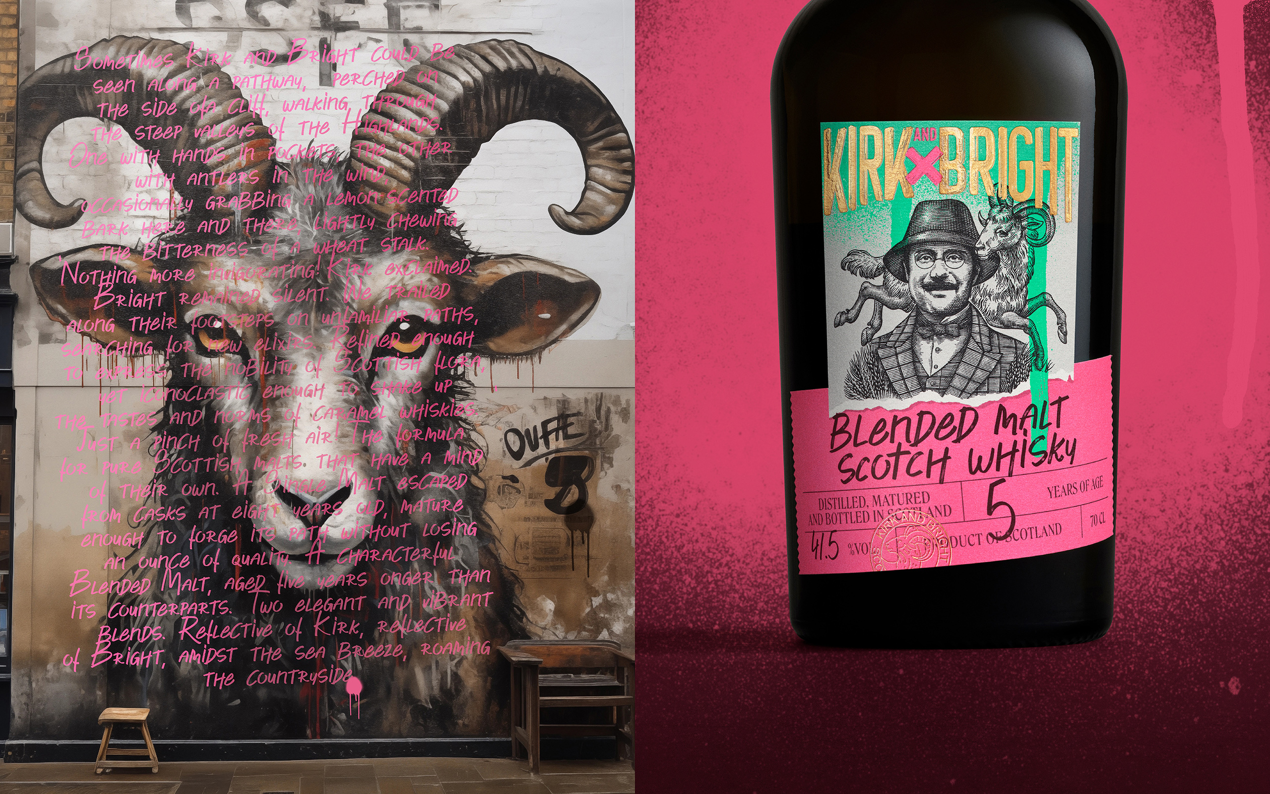
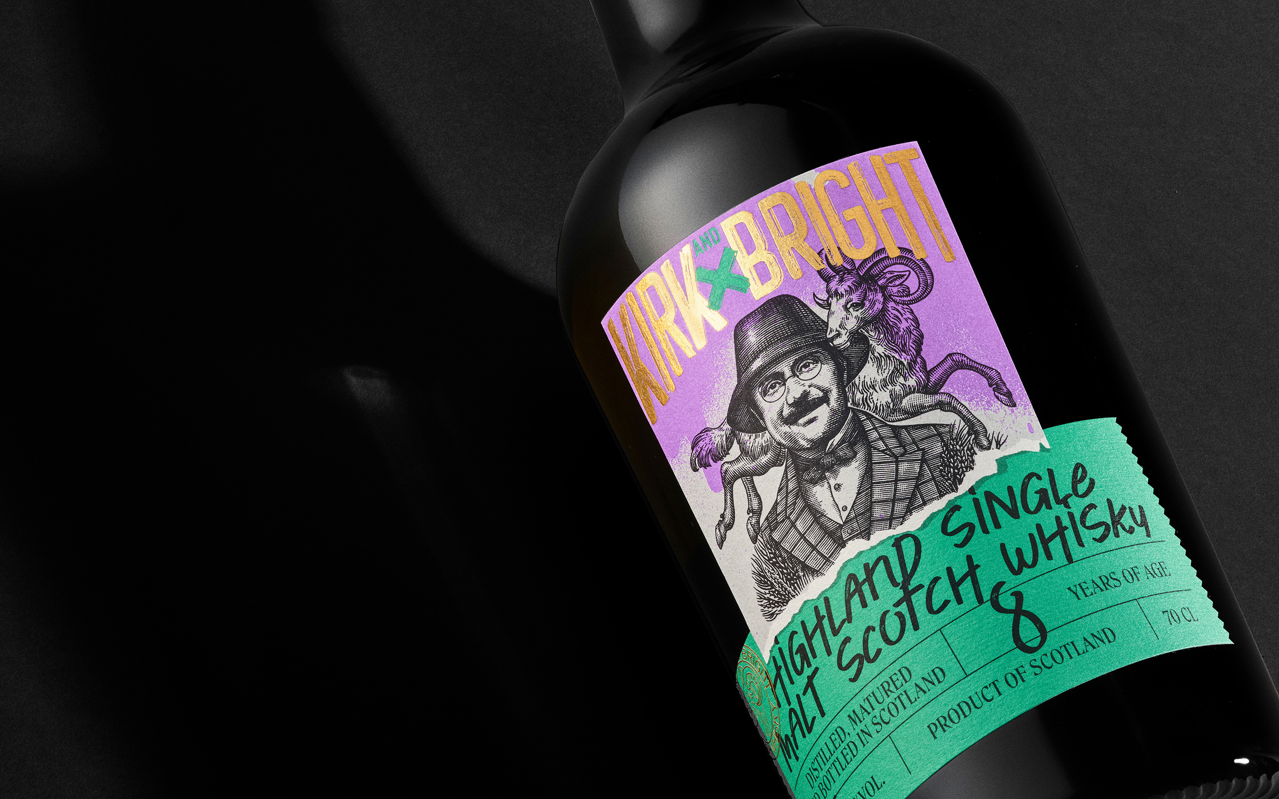
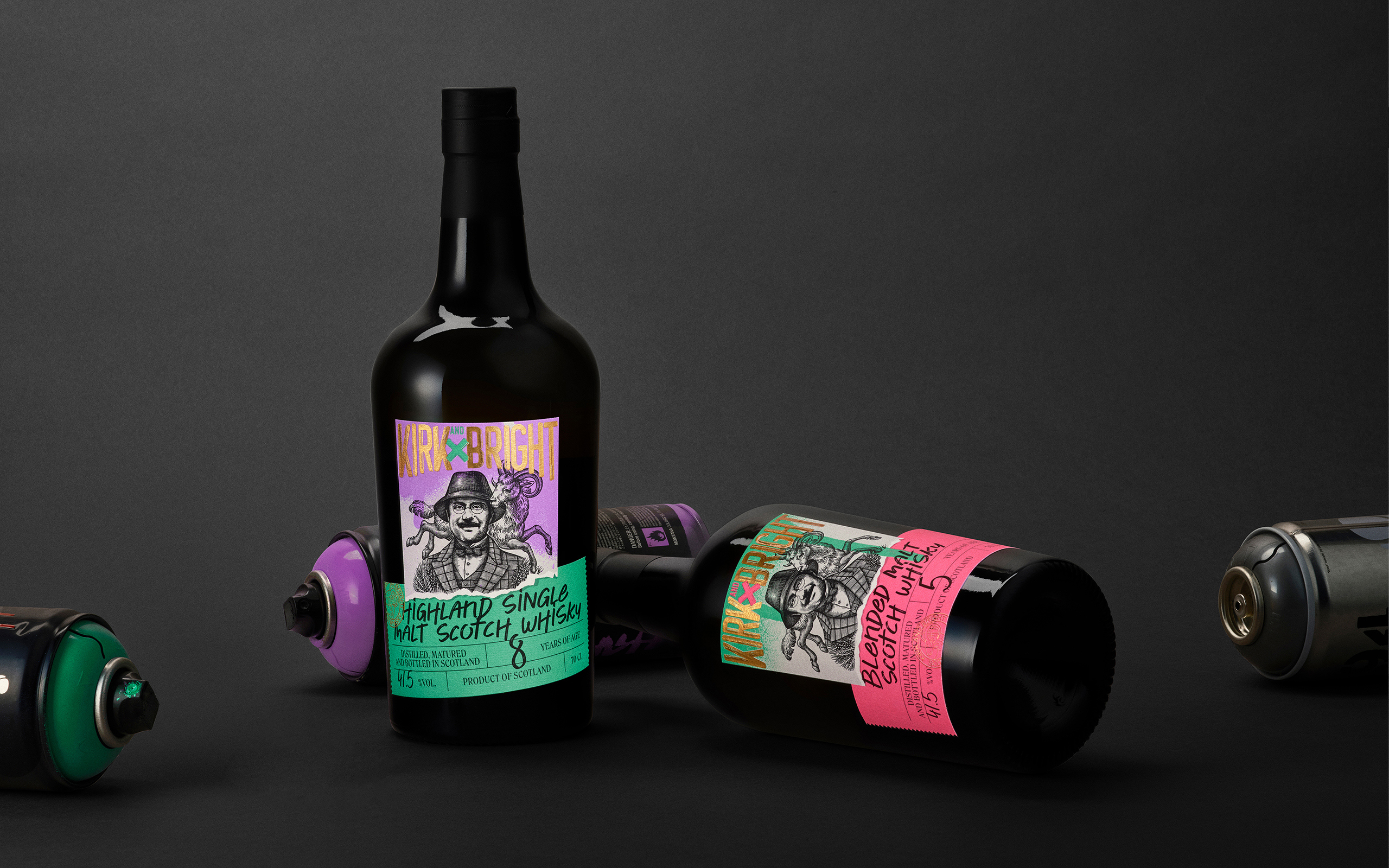
The Whisky Lodge enlisted the agency Be Dandy to create, from name to visual identity, its new disruptive and vibrant whisky brand: Kirk & Bright. This addition complements its portfolio of proprietary brands, alongside Orcines, for which the agency had previously worked and won a Bronze Lion at Cannes (Premium Brands Design category).

Client

Kirk and Bright

Missions

Naming
Packaging
Brand Platform

The goal ? To launch a Scottish whisky brand that appeals to a younger generation of novices seeking inspiring brands. The company aimed to be distributed by wine shops and major retailers, wanting to break away from conventional market imagery to stand out on shelves while remaining reassuring in terms of sector codes.

To create a strong brand, the agency drew inspiration from the origins of whisky in Scotland and a village with an enigmatic name: Kirkoswald. This name was adapted to create a story around Kirk & Bright: an English dandy and his sheep, embodying the irreverent philosophy of the brand and giving the whisky its unique soul. Kirk, the man, is a former punk who retreated to the hills of the Highlands, living as a hermit and collecting whiskies. Bright, the sheep, is his loyal and only companion. Despite their deceptive appearances—a dandy dressed in tweed and a typically Scottish sheep—Kirk & Bright are explosive and unexpected beings.

Facing an often dull and uniform offering, constrained by the traditional branding of whisky, the agency envisioned a bold and distinctly offbeat territory.

Drawing inspiration from the British punk movement, the visuals are sharp and colorful, evoking street art and vintage irony. The embossed labels with gold accents give a unique personality to these two whiskies, helping them stand out on the shelves. The result? Whisky bottles that shatter market conventions with vibrant, fluorescent colors and a playful use of torn labels featuring the two protagonists, Kirk & Bright.