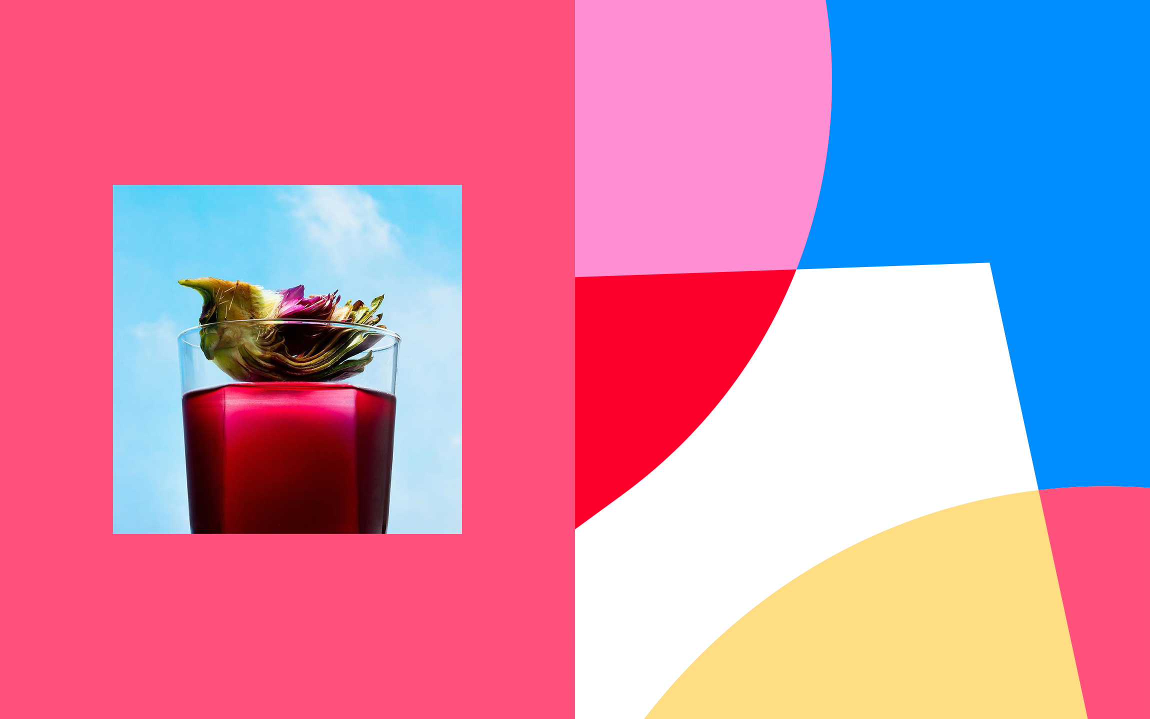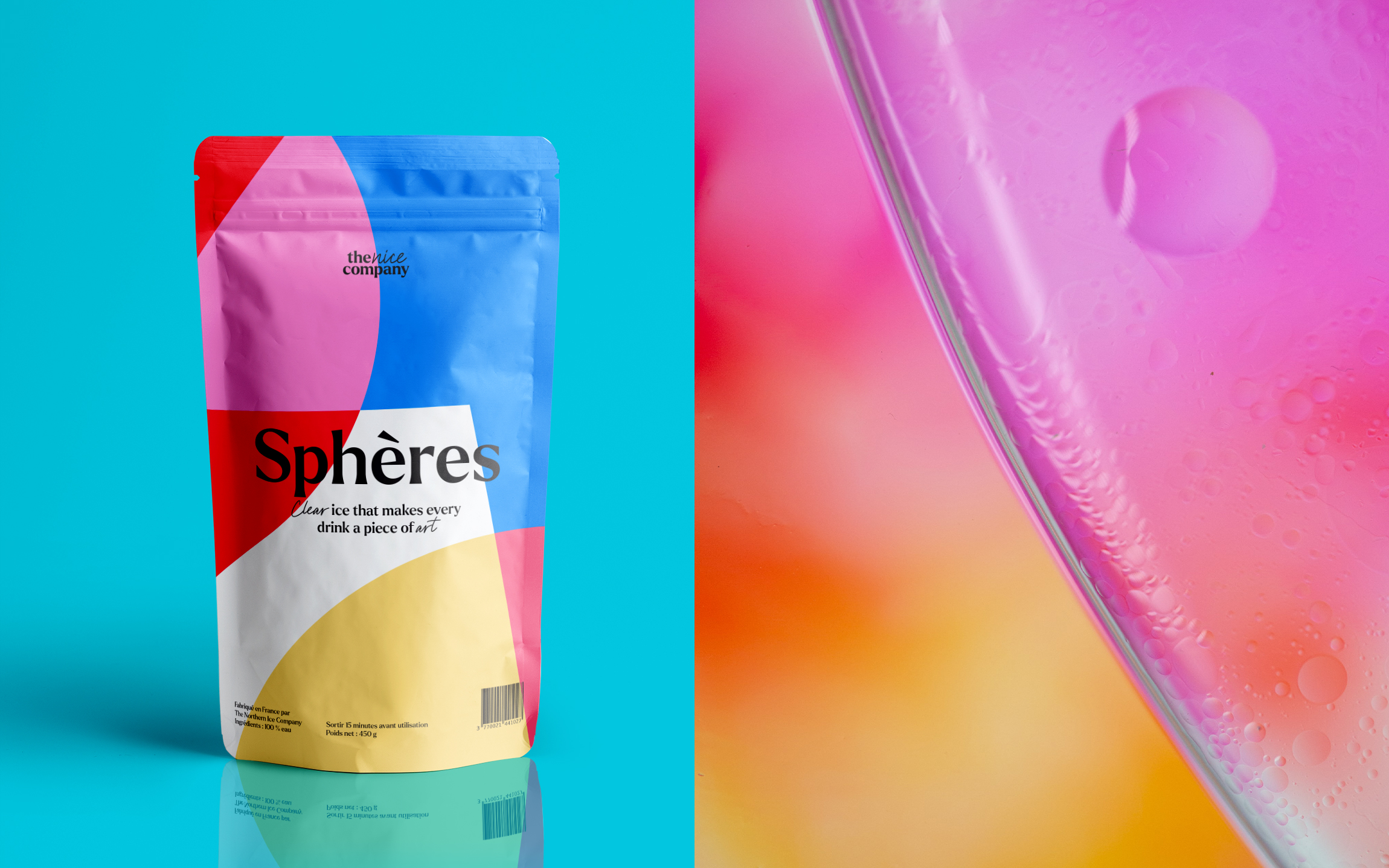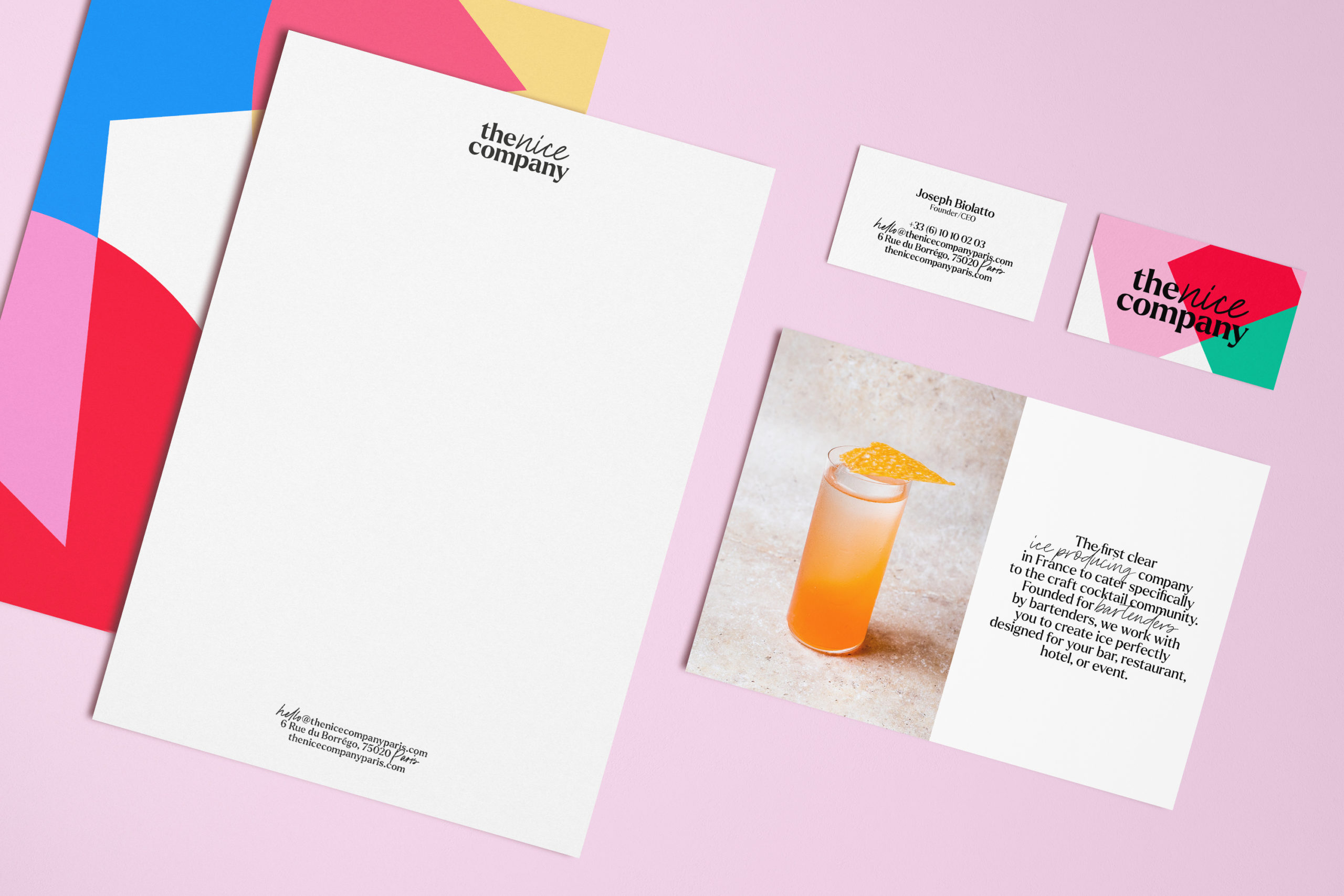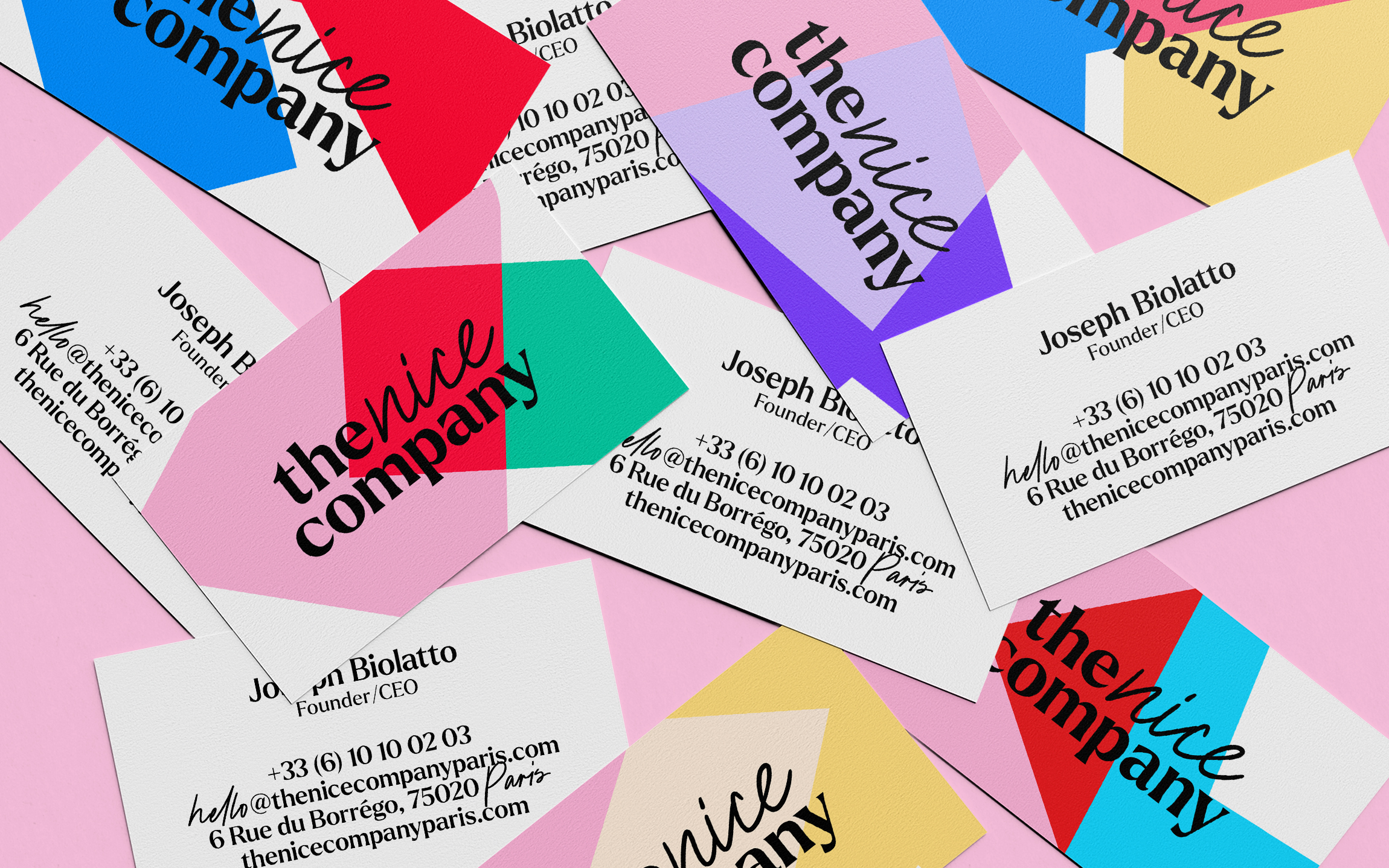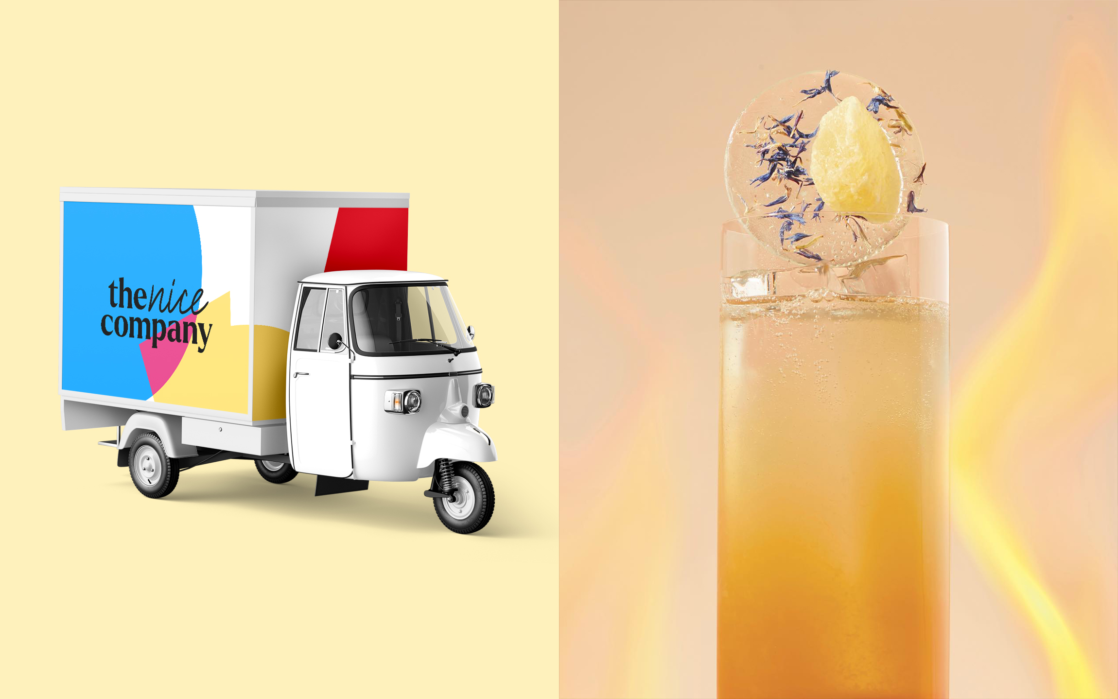
After their first collaboration for the Bâton Rouge menu walked away with three awards in 2017 and 2018, the mixologist Joseph Biolatto has reconnected with Be Dandy to boost the creativity and community of the new clear ice brand he has launched with his partner Brittini Rae: The Nice Company.
Client
The Nice Company
Missions
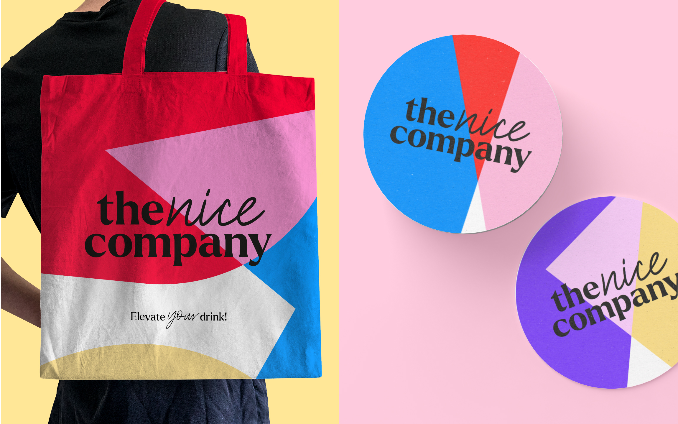
Branding
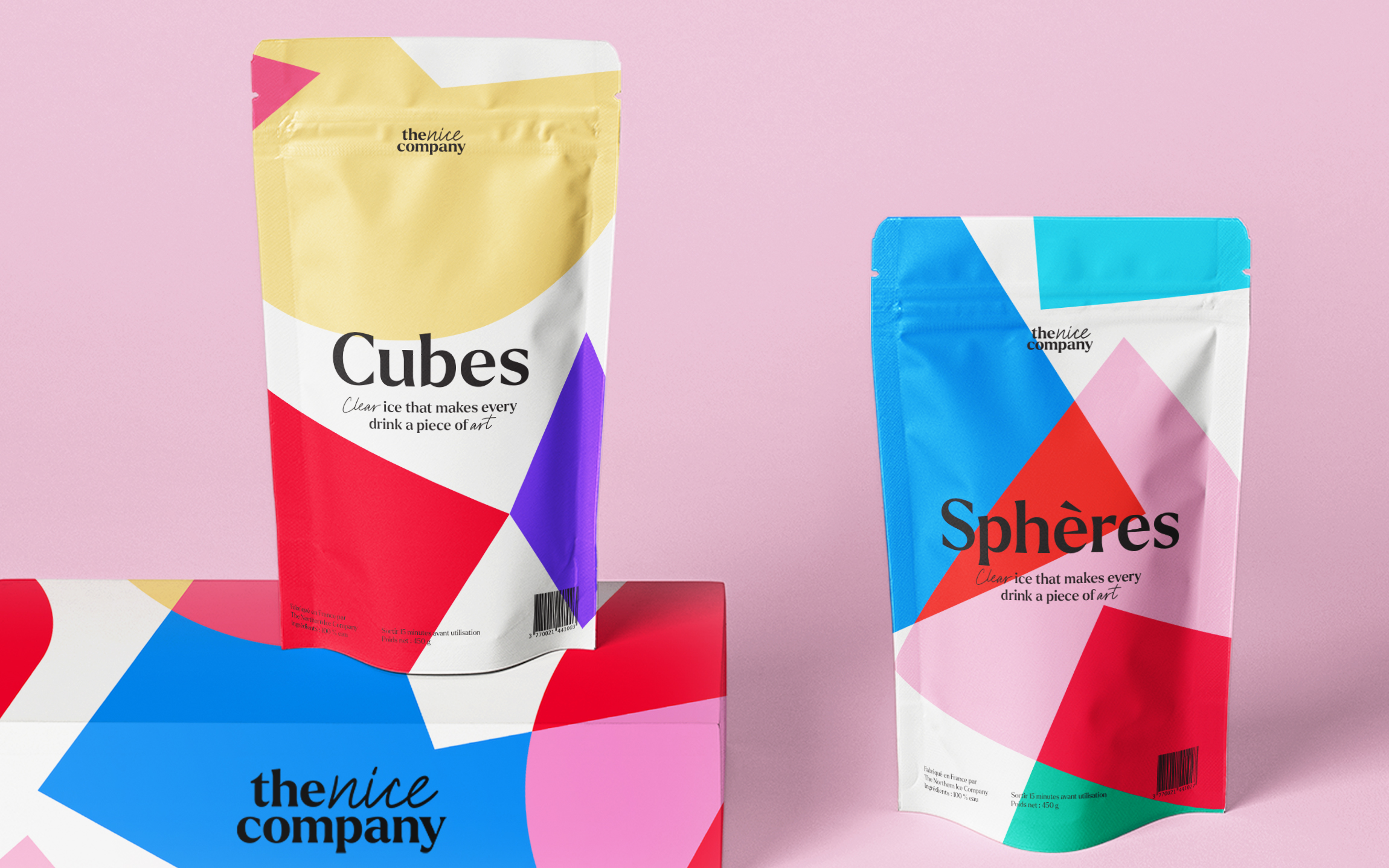
Packaging
Vehicles