Solution
The art of winning.
In keeping with this state of mind, the Be Dandy agency designed a brand that is assertive and goes against the usual image of law, inspired by the playful and dynamic dimension of oratorical jousts and games of skill.
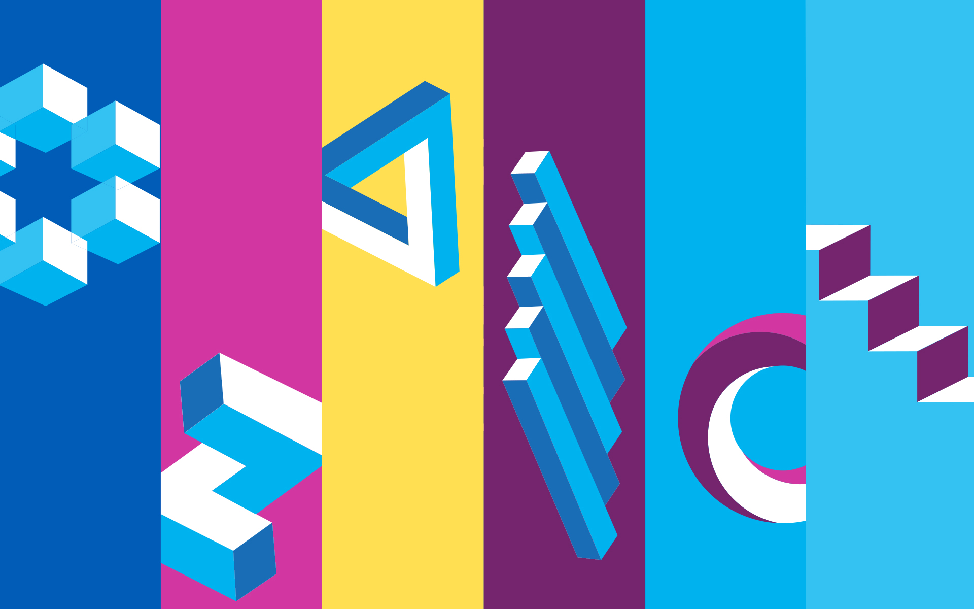
The clear and uncluttered logo is accompanied by a capital letter monogram which underlines ADDEN’s involvement with its customers and its ability to resolve complex issues. The letter A is the firm’s initials and symbolises its desire to lead each case to victory. The identifying colour: a light, bright blue, embodying modernity and stability. The six complementary colours, borrowed from the digital world, combined with the 3D shapes in movement, illustrate the creativity and agility of the team.
The new identity reflects the firm’s image, uniting a team located throughout France and promoting its uniqueness to all its audiences.

