Take people where [1] they've never been
Does your brand express the dreams [2] within you?

“We thought the analysis of our brand and communication positioning was particularly thorough and on the money!”

Maira Caldoncelli-Vidal Founder of MU architecture

Client

MU architecture
Paris, France

Awwwards - 2021 Honorable Mention, Mu Architecture

Club des Directeurs Artistiques – 2021 Bronze Award, Design branding, lettering, MU Architecture

Missions

Strategy
Branding
Web Design
Edition

Mu is the result of three architects from eclectic cultures coming together (Japan, Brazil, Austria). Its blend of happy and unique styles formed the cornerstone for the brand’s new identity and strategy.

A signature that draws on the spiritual over material


Mu is the name of a legendary utopic place built on harmonious diversity where cultures come together. It’s also the philosophy of a firm whose humanism and collective intelligence we tried to reveal. Mu creates more than architectural totems; these are places with heart whose architecture is alive and designed for the wellbeing of the people living in them.

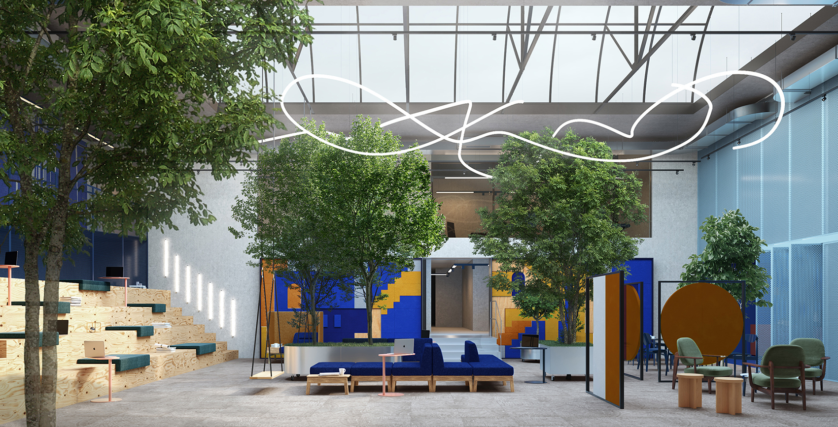
An identity reflecting a unique ecosystem, between heaven and earth


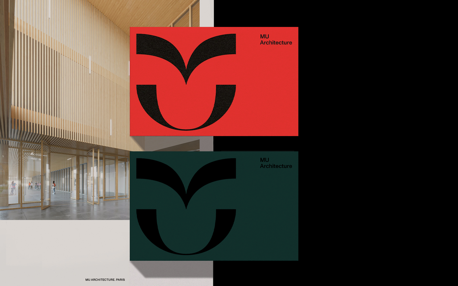
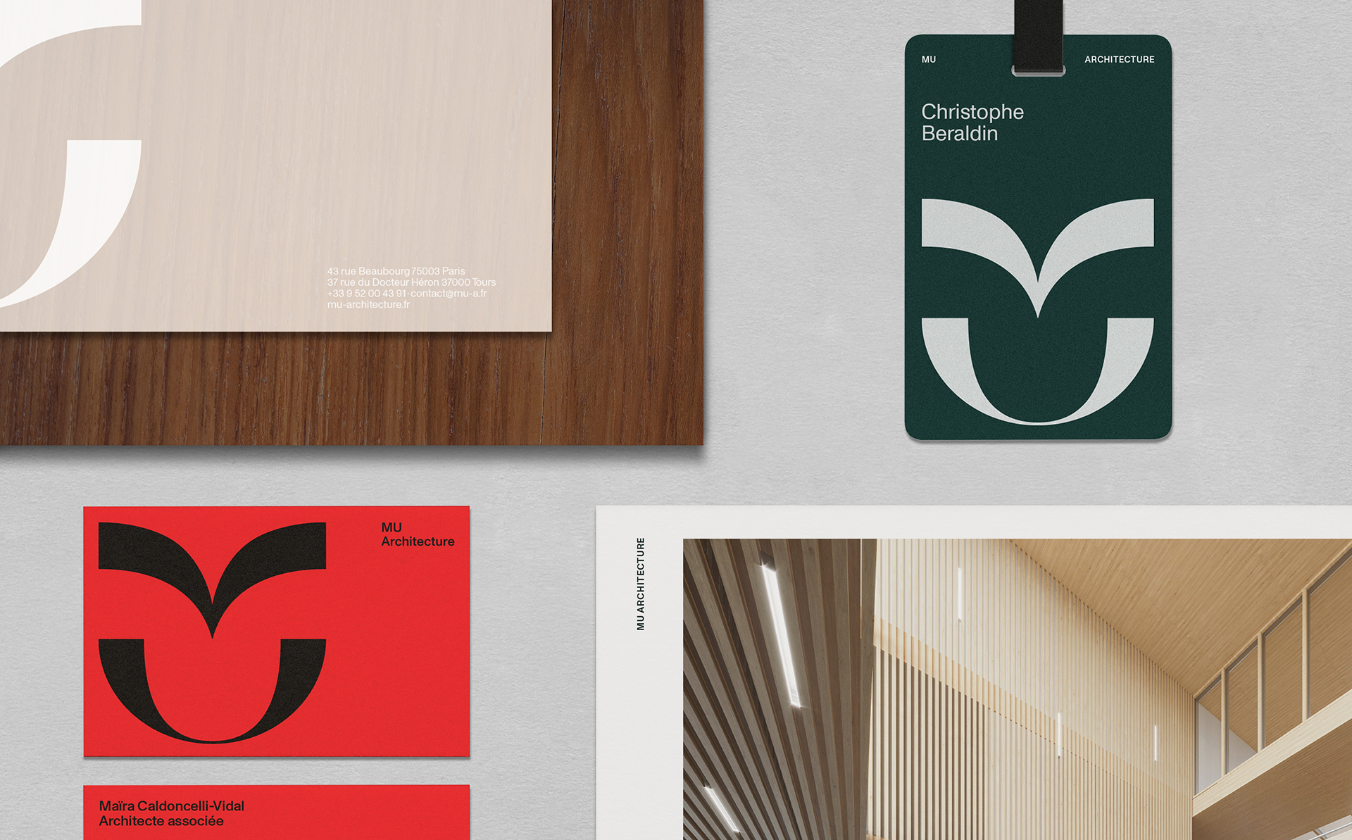
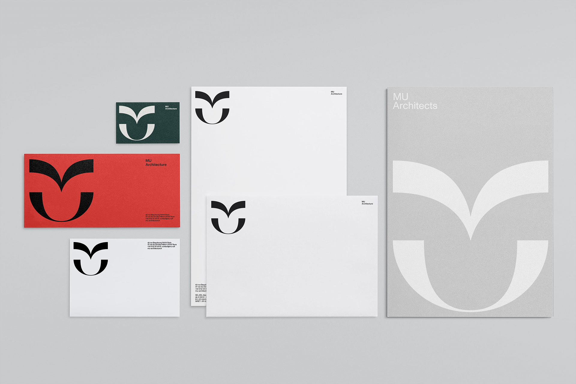
It’s hard for architecture firms to avoid constructivist logos with sharp shapes, straight static lines highlighted by black and white. These signature features are a given but they don’t take their landscape into account. We went in the opposite direction and designed an open and carefree identity for Mu.

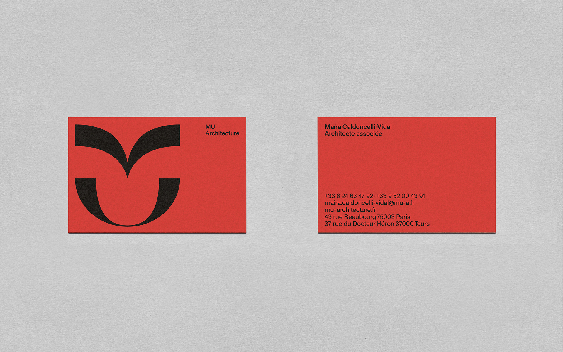
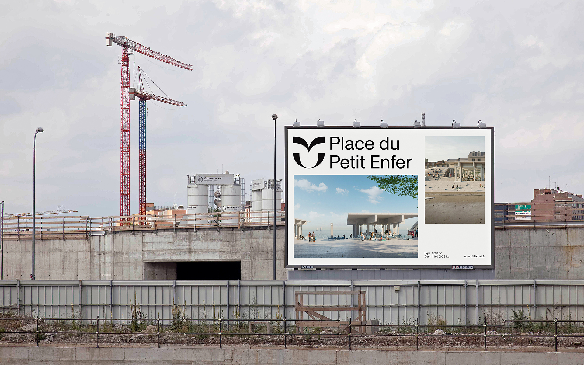
The curvy and free logo quietly captures the founders’ inspired collaborative approach. Its complimentary shapes come together, open up to each other and interlace. They reflect the firm’s sensitivity, its ability to understand the places and people living there, to work closely with the people building them. Result: spaces that fit into their environment so well that they’re able to restore balance to the solid and hollow, amusement and boredom, nature and the city.

Just like the living materials that change over time and which Mu has made its hobby horse, the logo lives in its time.

It’s designed like a flag, for the firm and its legendary land, a unifying symbol for those who share a human vision of architecture where people live well. A movement that opens new doors in a very limited market.

“We asked Be Dandy to work on our brand and identity: positioning in our business sector, strategy and communication and a new visual identity. We thought the analysis of our brand and communication positioning was particularly thorough and on the money! We were very surprised and excited when we saw the new visual identity and the communication orientation potential it brought with it! We’re very proud of our new brand image.”

Maira Caldoncelli-Vidal, Founder – le 8 mars 2021

Related projects

science po portrait

Sciences Po

Novaxia HQ

logo Novaxia rebranding

Novaxia Rebranding