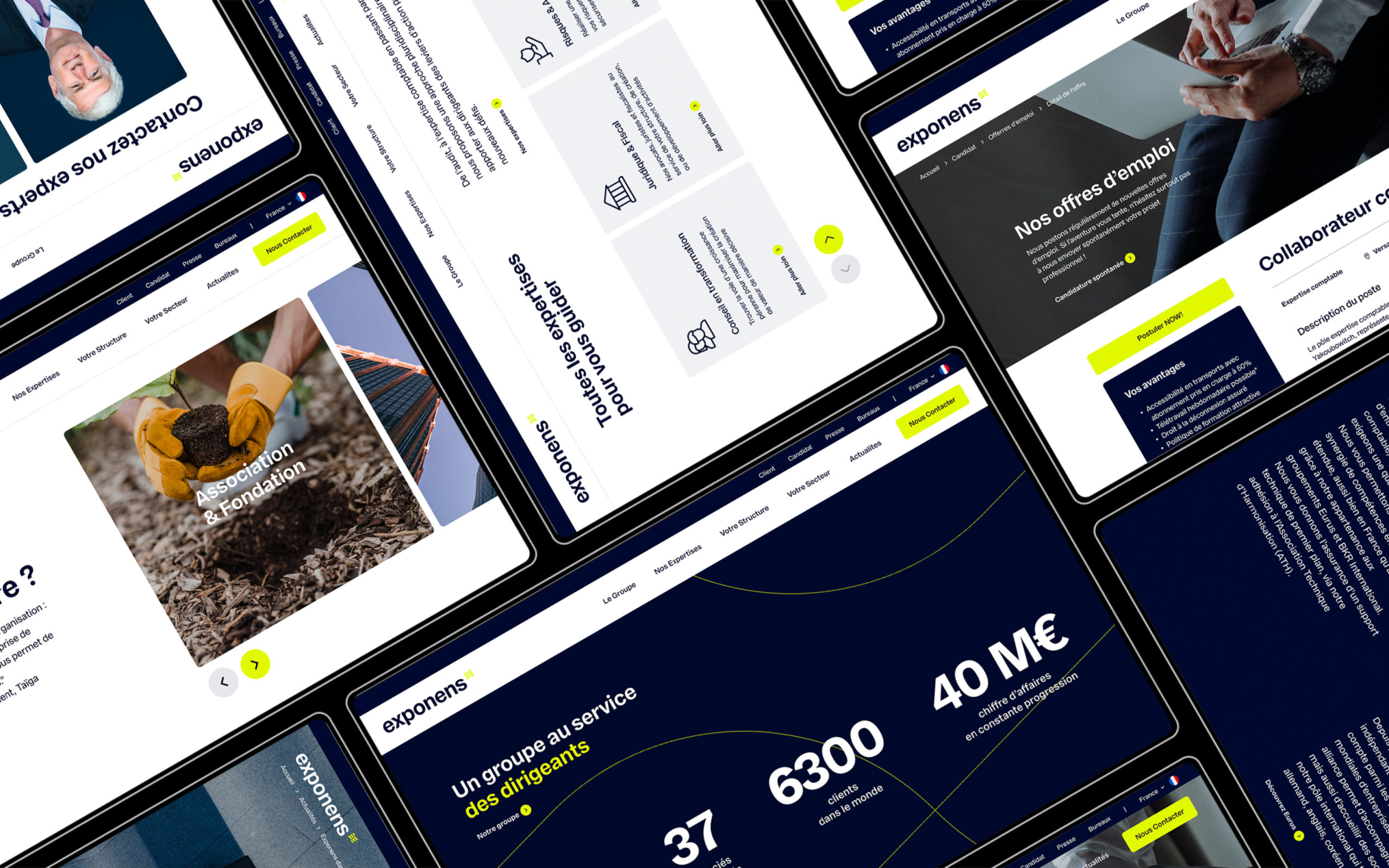
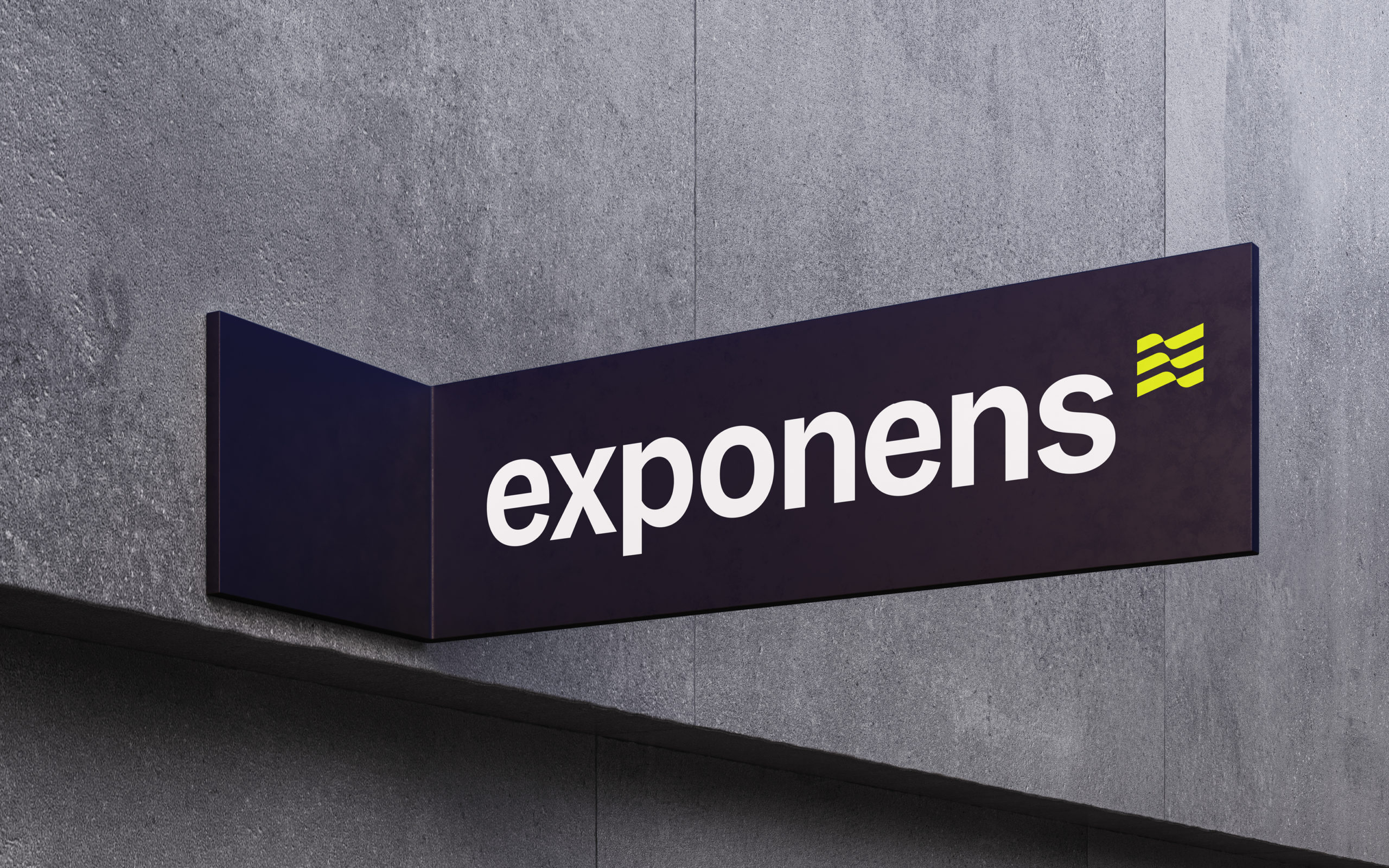
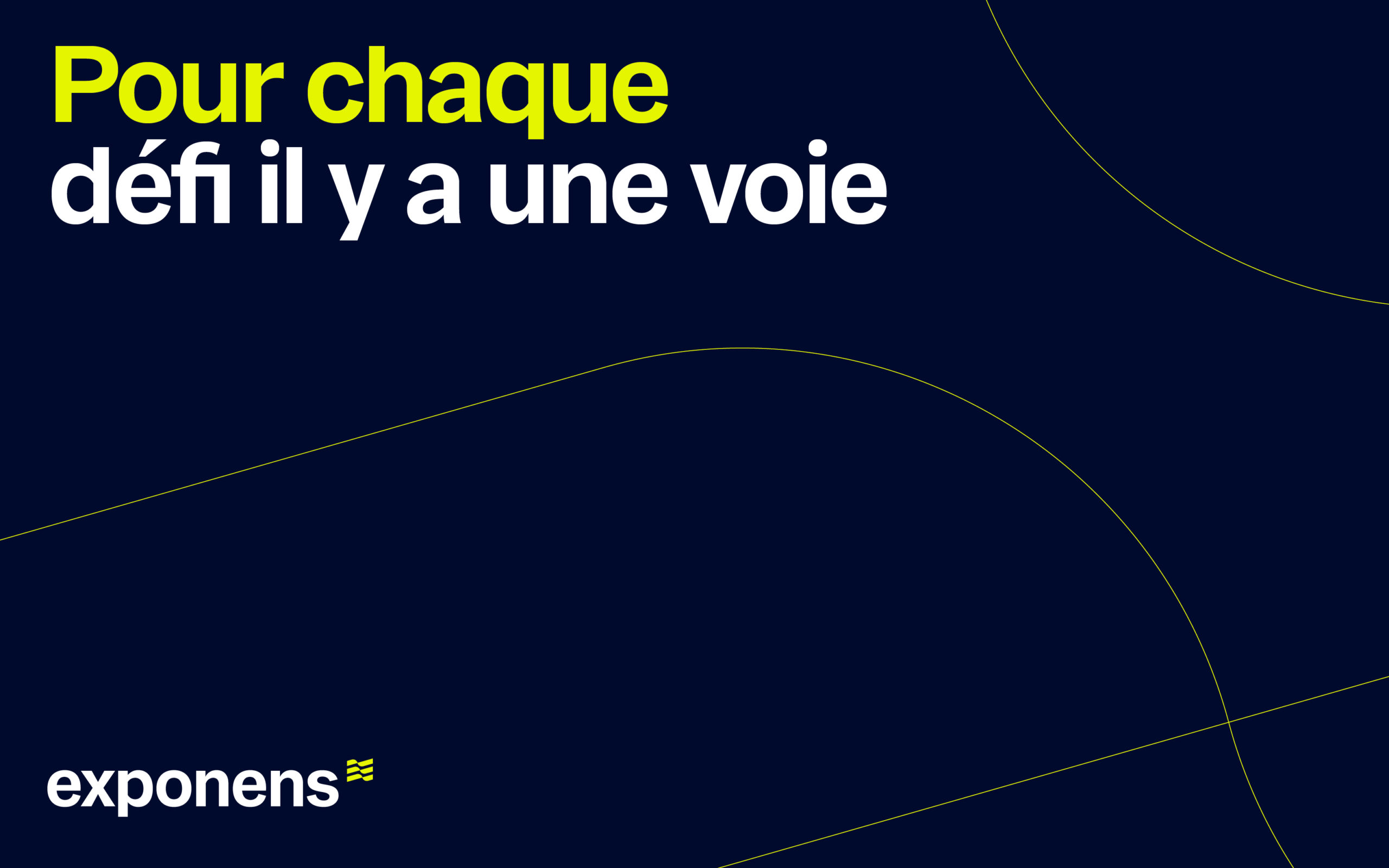
“We wanted to redefine our brand platform and redesign our visual identity. Be Dandy supported us throughout, from brainstorming to getting staff on board. We have now created a more modern and appealing image of our company. The branding features are currently being rolled out.”
Thierry Legrand
Associate & General director
Client
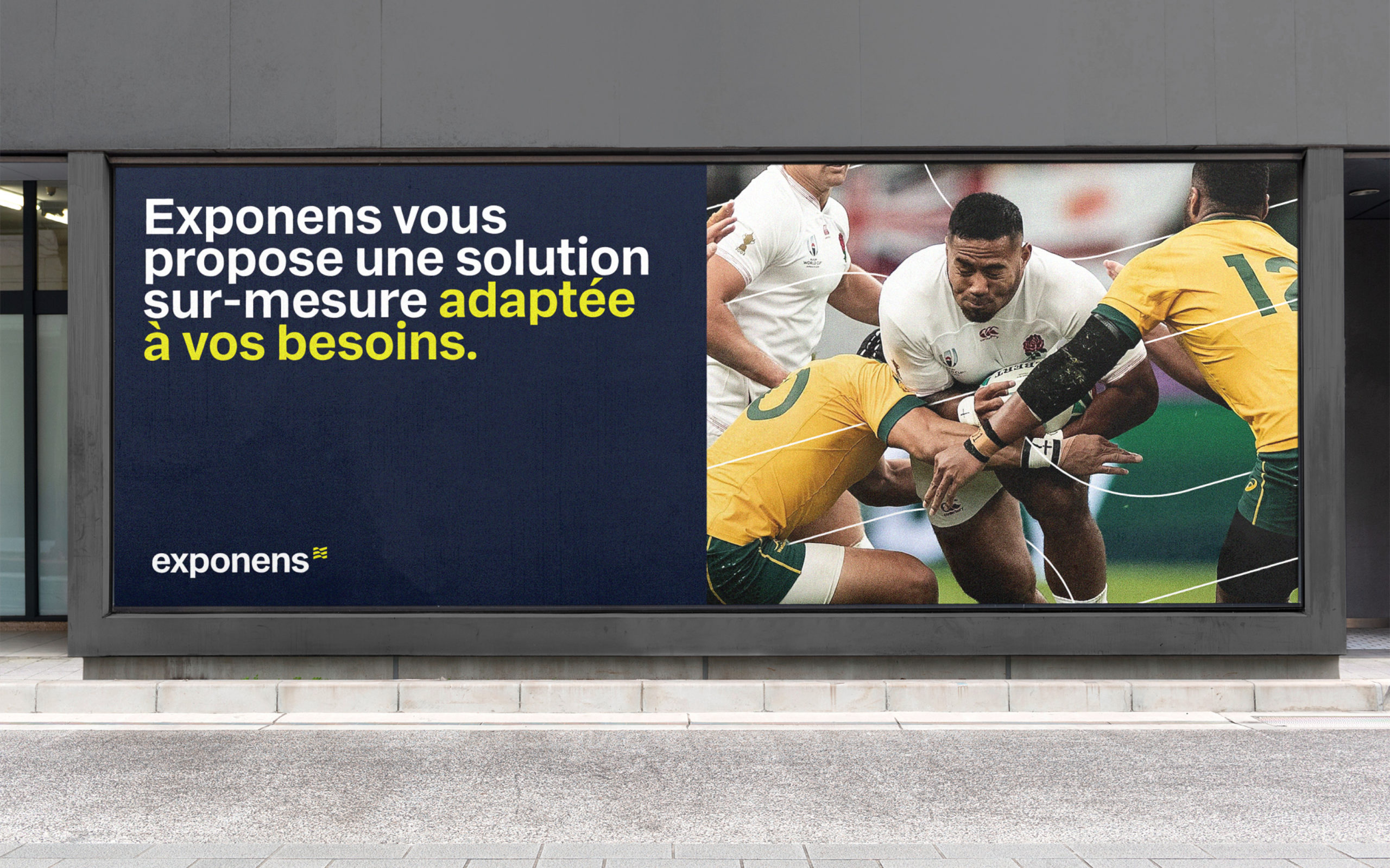
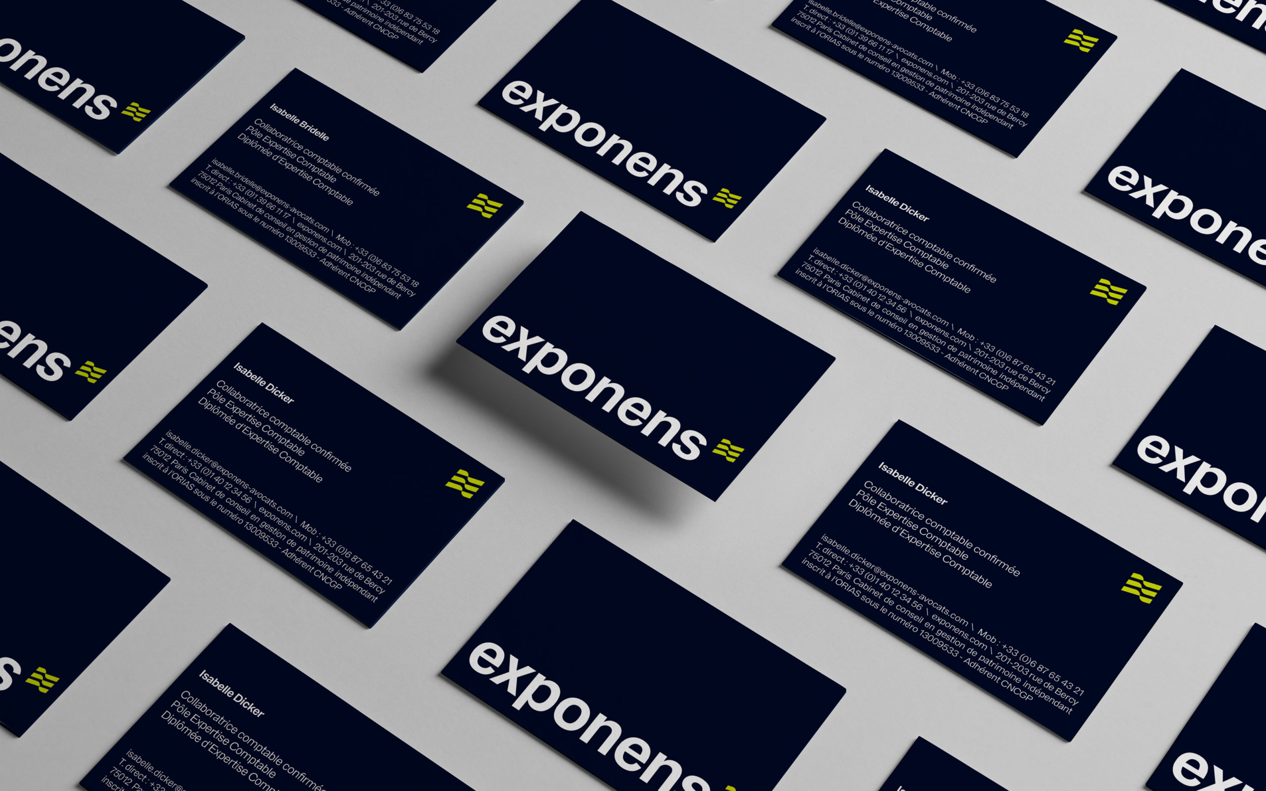
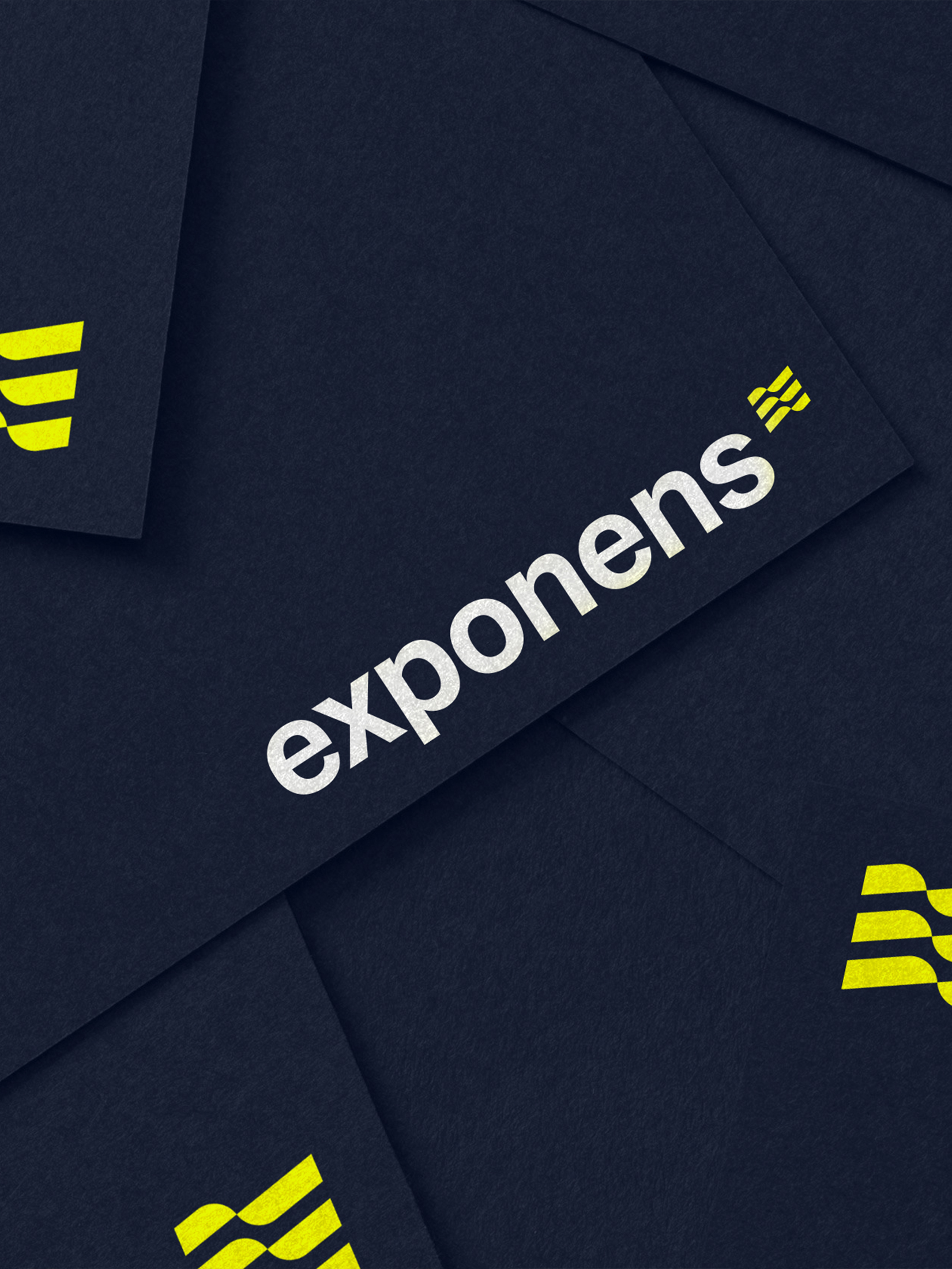
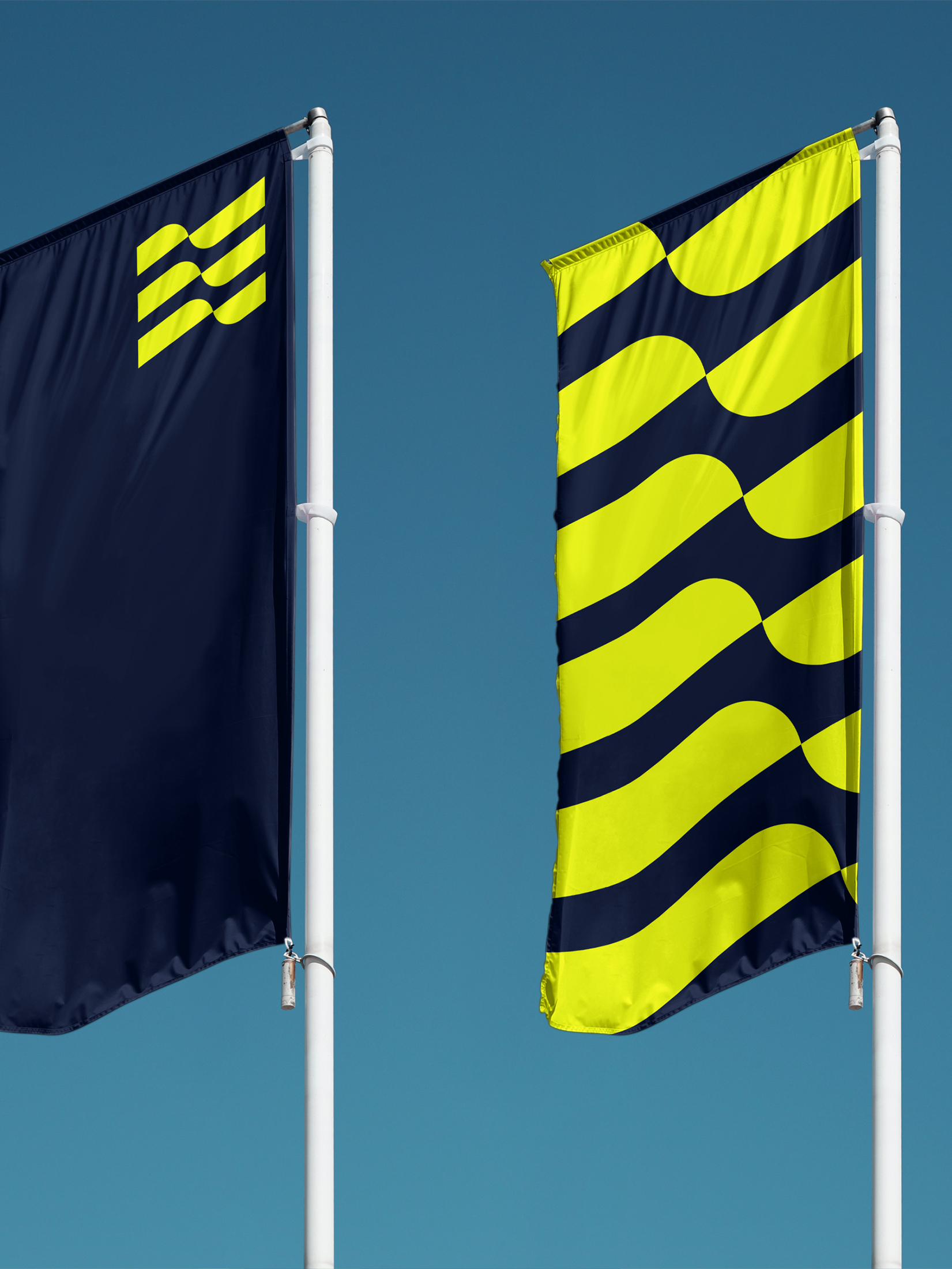
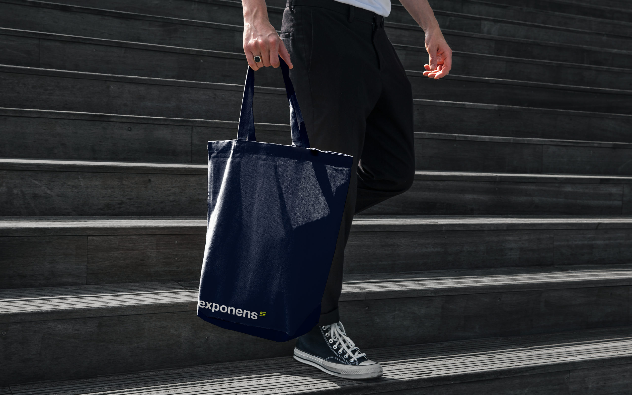
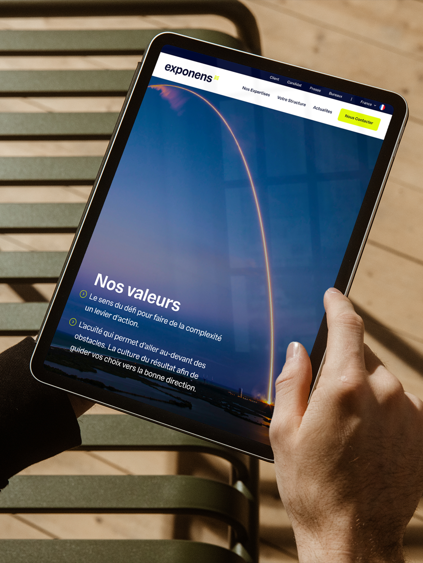
Exponens
Missions
Strategy
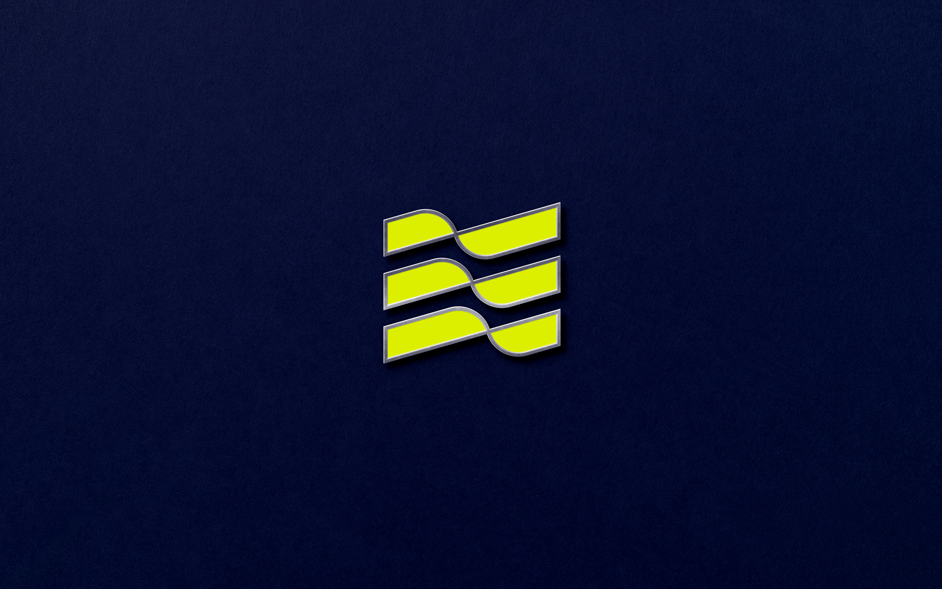
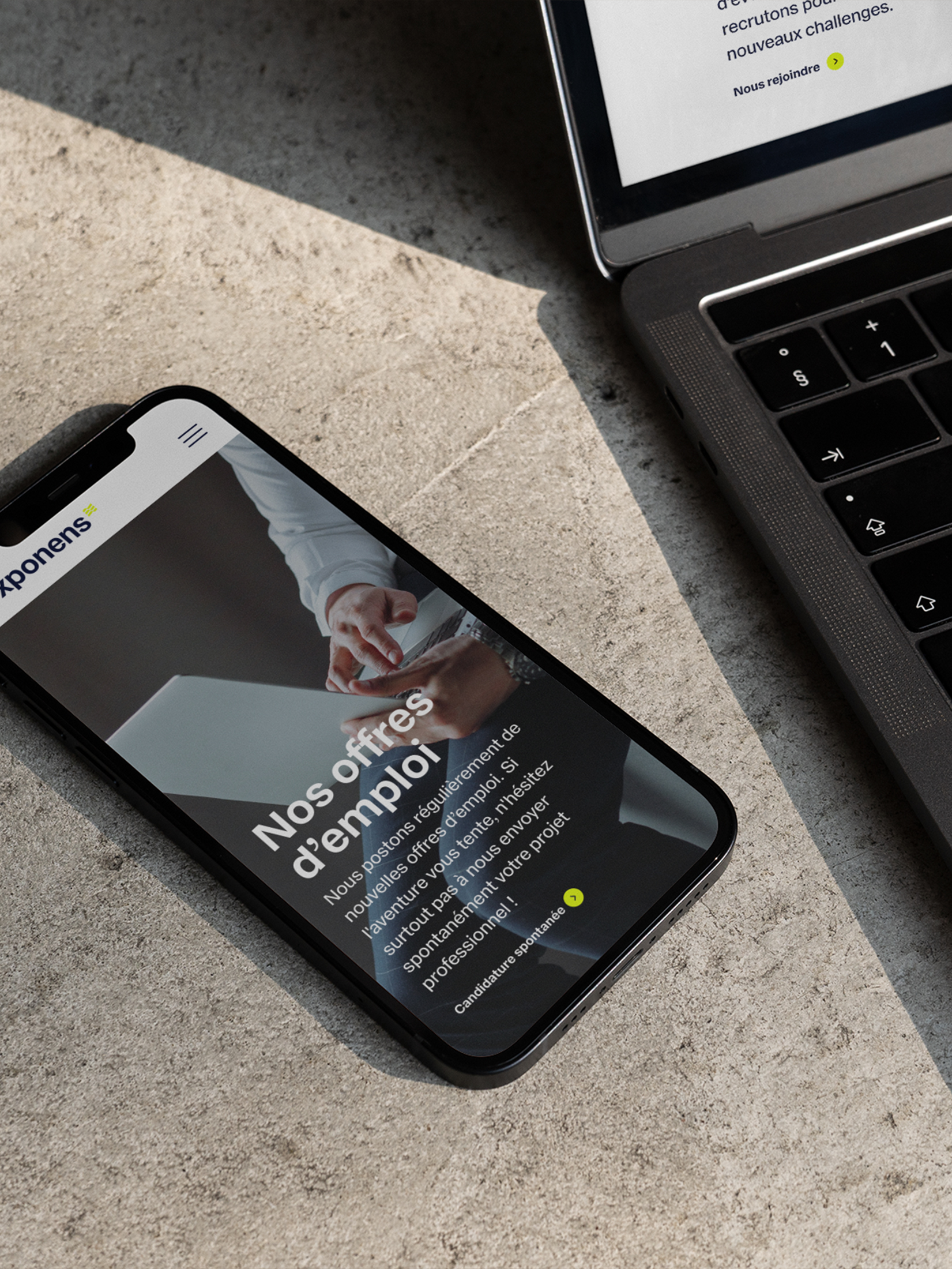
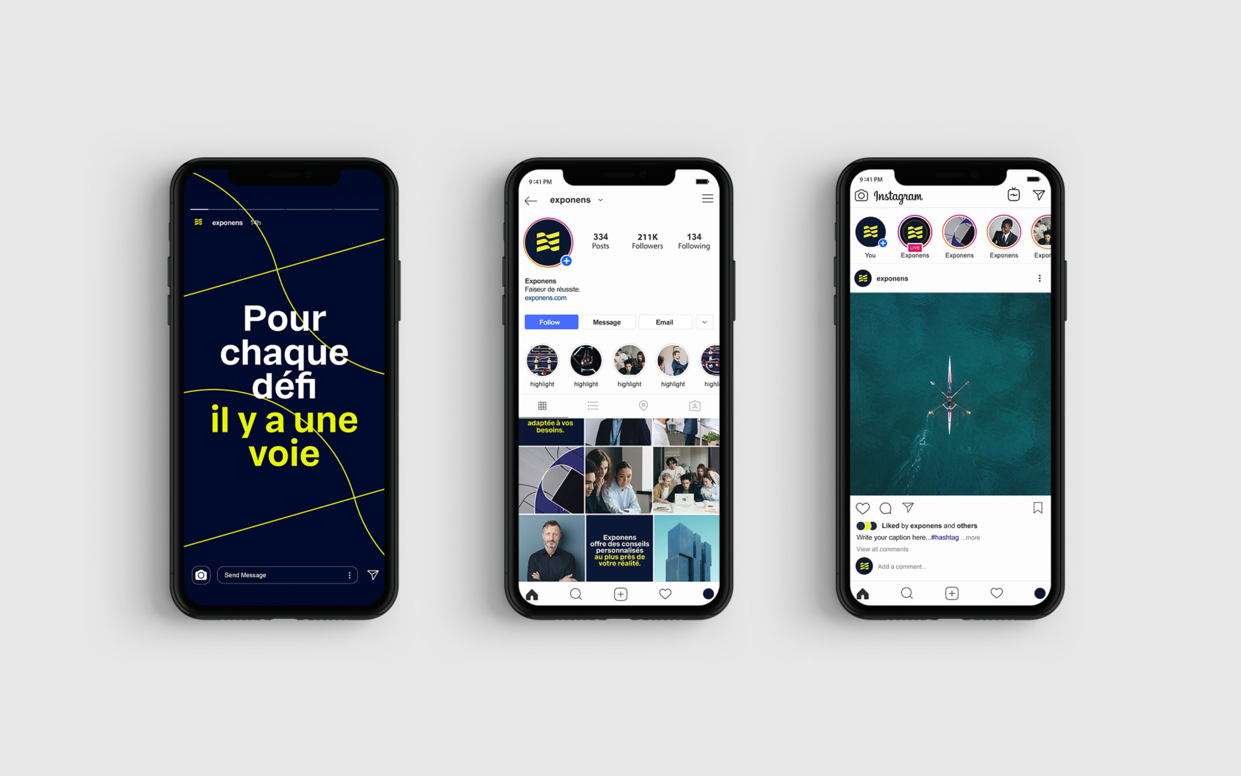
Rebranding
Visual Identity