Take people where [1] they've never been
Does your brand express the dreams [2] within you?

For more than twenty years, Method Studios has brought imagined worlds to life across film, television and advertising. Behind every image lies the same ambition: to go beyond the visible and reveal the unexpected.

To accompany the studio’s evolution, Be Dandy conceived an identity that embodies this perpetual sense of movement. An identity designed not only to be instantly recognisable, but to evolve alongside the creative work it represents.

Client

Method Studio

Missions

Visual identity
Brand system
Tone of voice
Motion videos
Look and feel website
Social media
Brand platform
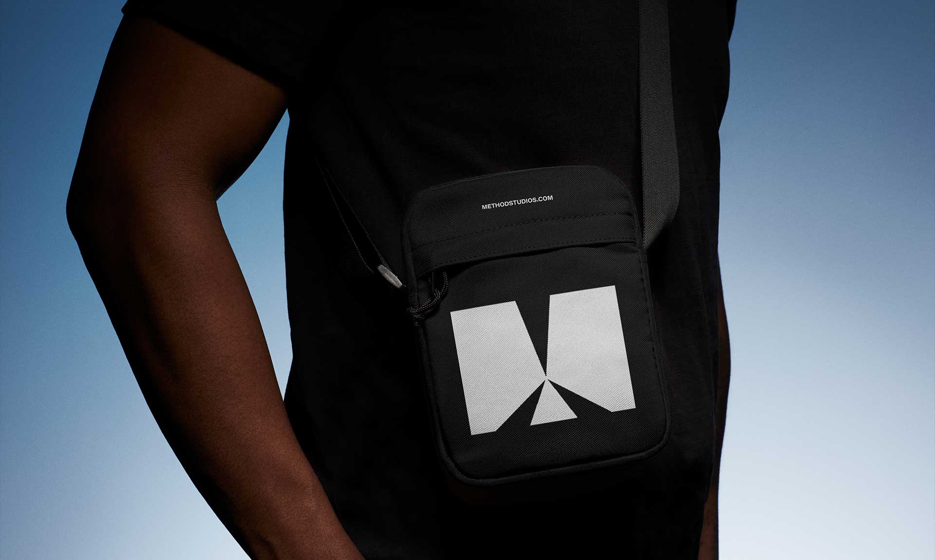
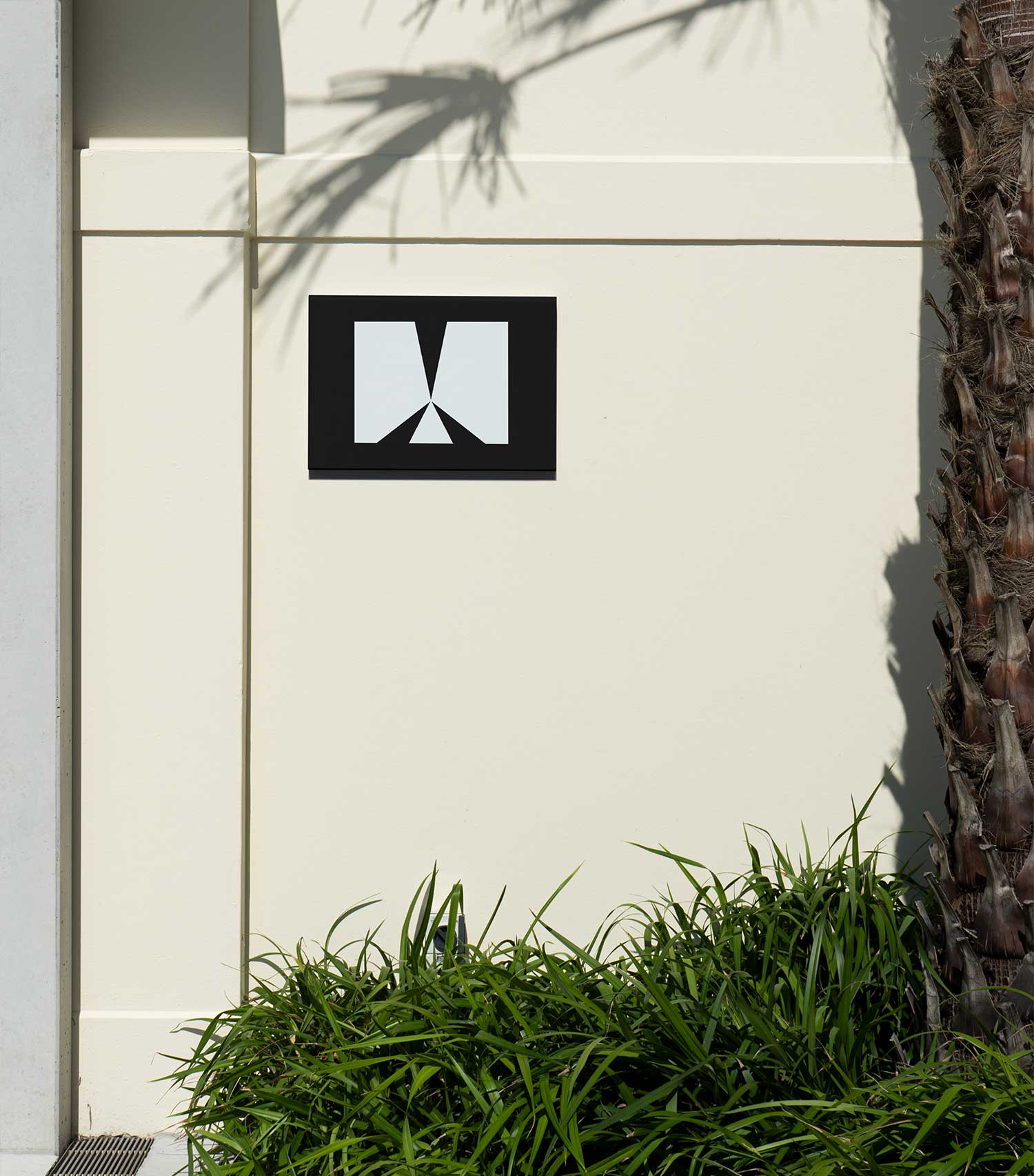
At the heart of the visual identity, the letter M becomes a space for exploration. Its outer frame remains constant while its interior continuously transforms, generating an endless array of compositions.

Through this principle of metamorphosis, the identity expresses the very essence of Method: a strong, enduring structure that makes room for boundless creativity. Each variation offers a new way of telling a story while preserving a symbol that remains instantly recognisable.

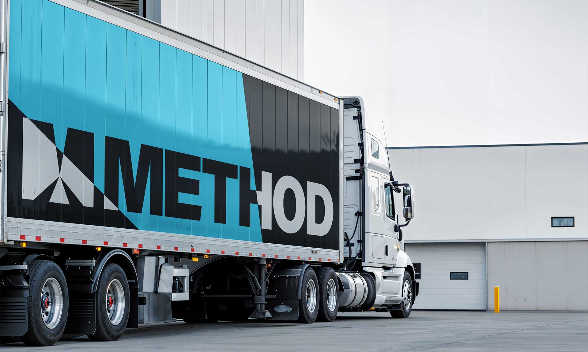
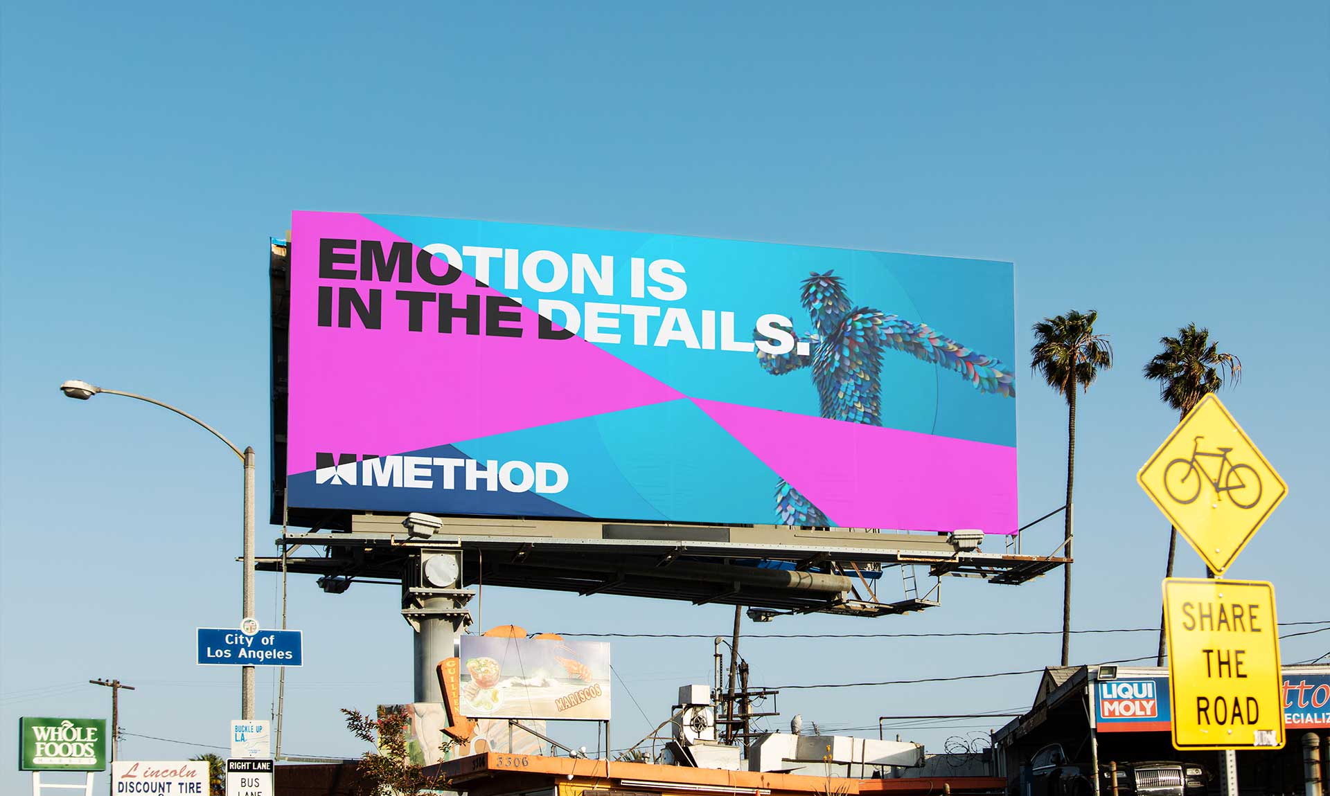
The identity is built on a constant interplay between stability and movement. Black and white form the foundation of the brand, while a palette of twelve colours spans the full spectrum, expressing the diversity of creative worlds and imaginations explored by the studio.
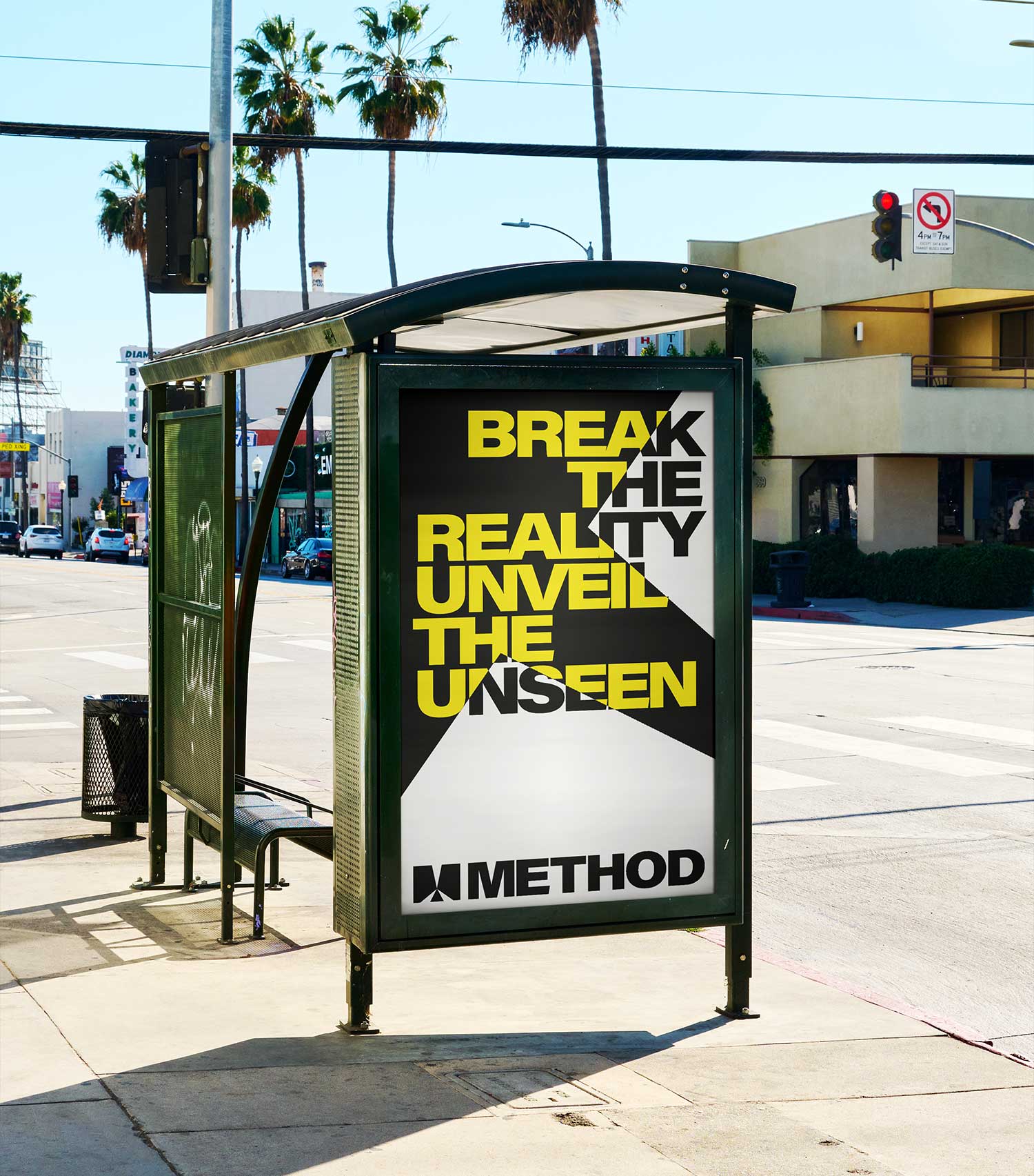
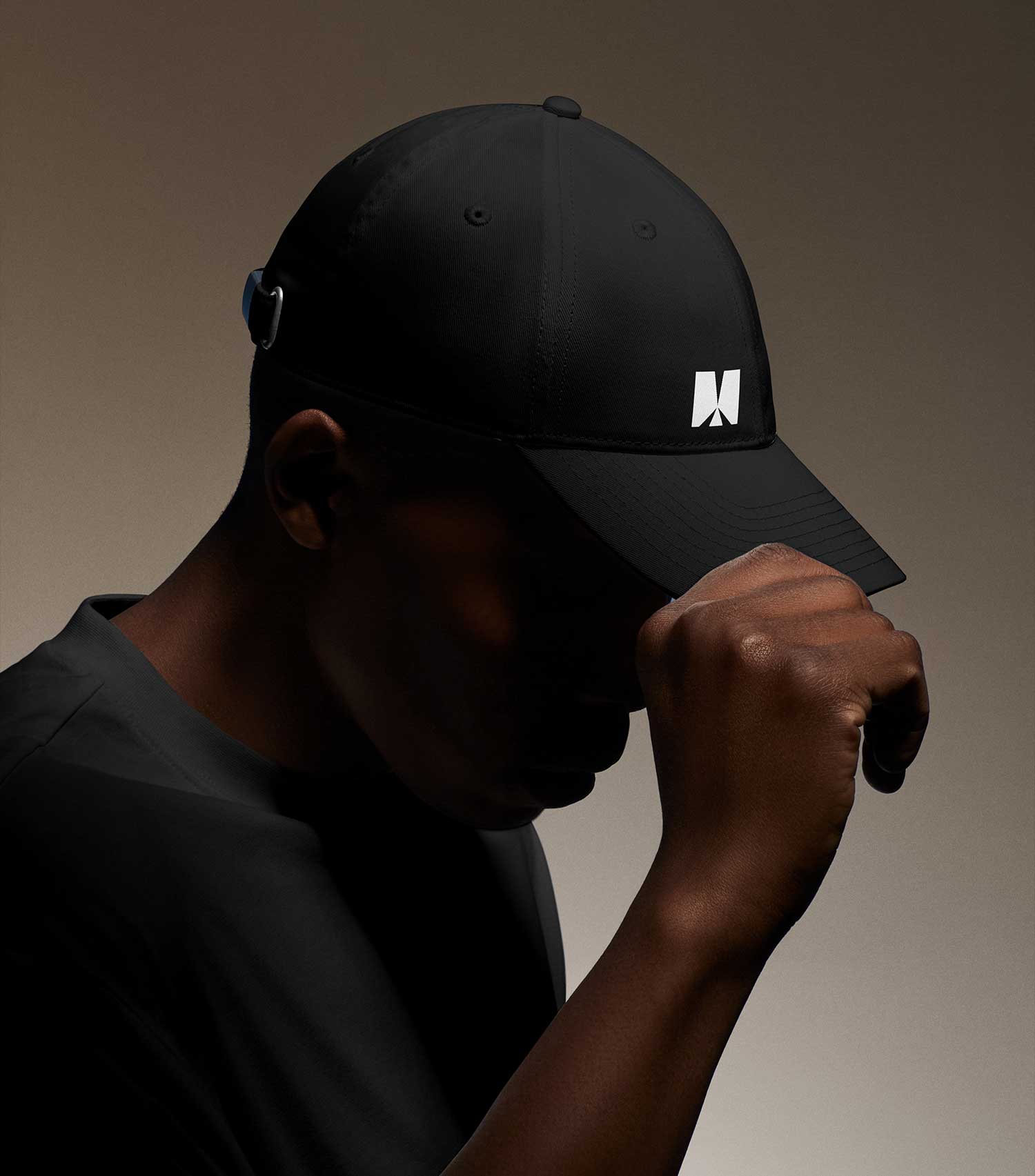
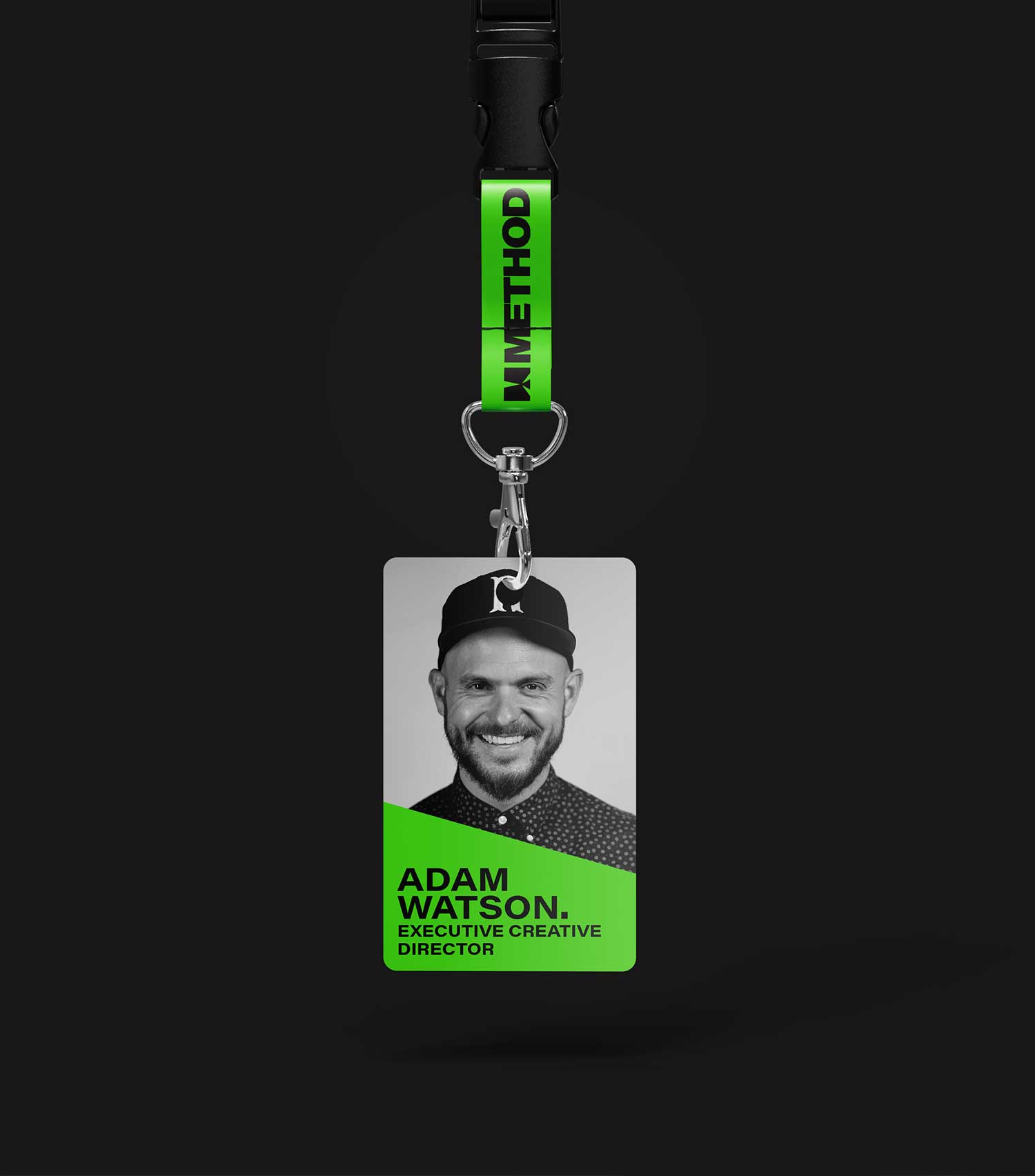
More than a logo, the M becomes a graphic language. It unfolds across every touchpoint, continuously reinventing itself from one project to the next while remaining unmistakably Method.

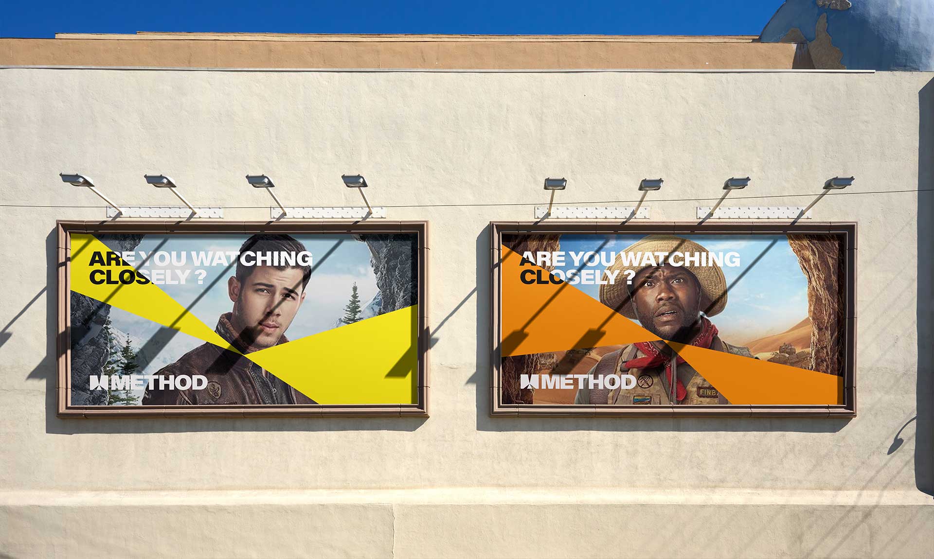
Inspired by the concept of Framed Perception, the identity invites us to shift our perspective. To look differently. To move beyond the surface and uncover what lies beneath the image.

Much like Method Studios’ creative approach, it reminds us that the most compelling ideas often begin with a new way of seeing the world.