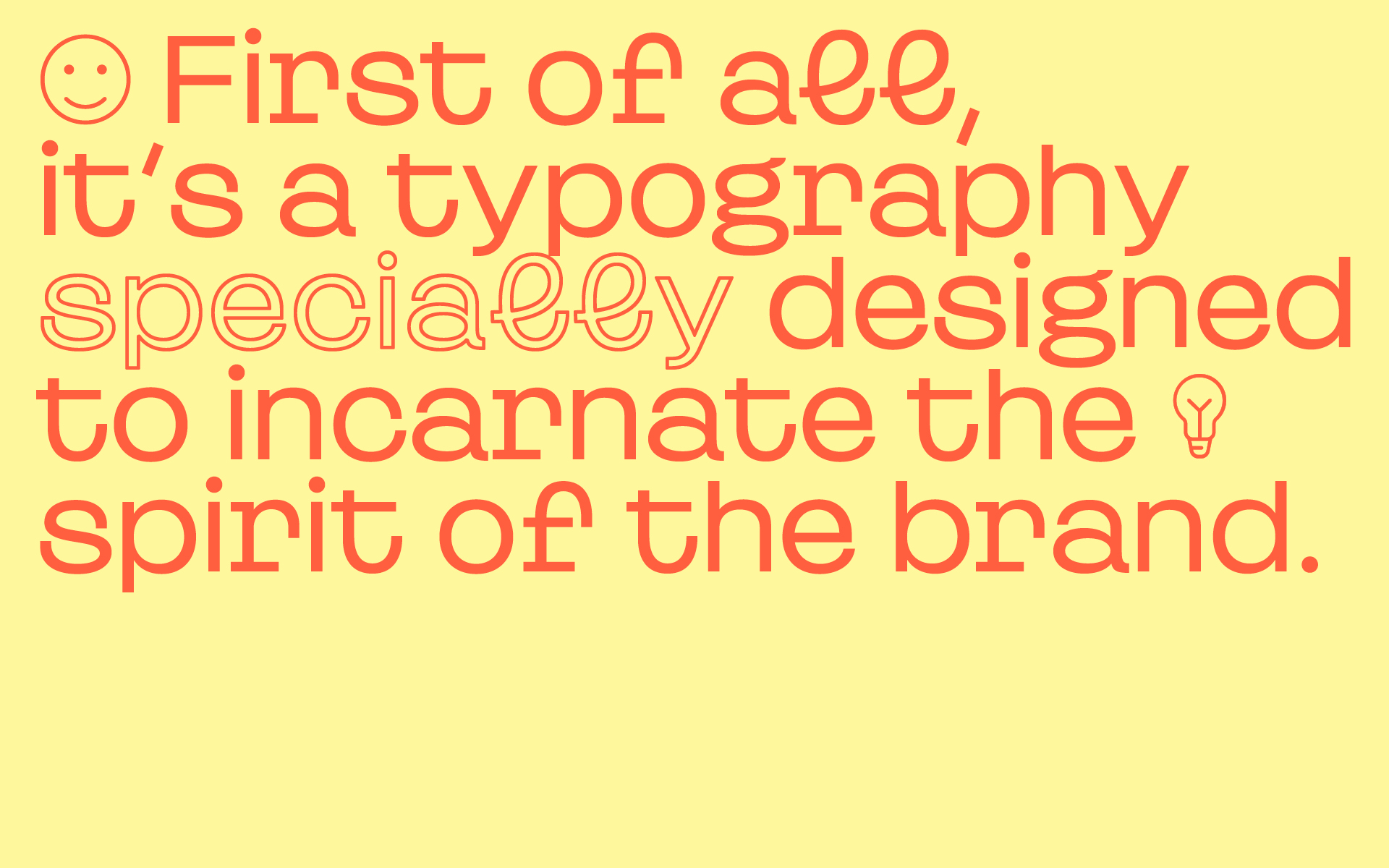
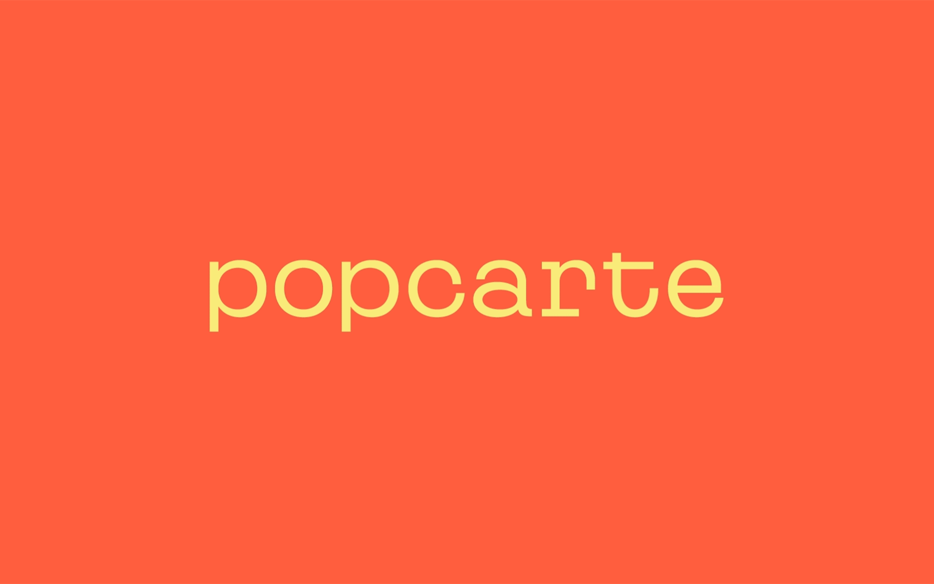
Take people where [1] they've never been
Does your brand express the dreams [2] within you?

“It was a real pleasure to work with you, as much for the accuracy of your analyses and your wise, clearly asserted viewpoints, as for the high quality of your artistic direction and your creations.”


Benoit Martin Founder & CEO    

Client

Popcarte

Transform Awards - 2023 Bronze Award, Best use of typography, Popcarte

Worlwide Logo Design

Award - 2022 Gold Award, Custom Typeface, Popcarte

Missions

Strategy
Visual identity
Experience
Website
Social media

Popcarte designs, prints and delivers all kinds of cards and announcements so everyone can share their news and milestones, no matter how big or small. Be Dandy delved into Popcarte’s personality to showcase its wealth of creativity in the design of everything from the new brand strategy to the bespoke visual identity.


Pop: from a card style to a bold state of mind


The idea behind the rebrand is to showcase the wealth of creativity that has always fuelled Popcarte and highlight its best assets: a colossal card range to suit any style and requirement as well as endless customisation options. Be Dandy has used these assets to make Popcarte the leader when it comes to unleashing your imagination.


What’s the idea ? The agency wanted to move Popcarte away from a divisive Pop aesthetic to make Pop a true state of mind: a natural and joyful way to see life, where cards and announcements aren’t something you feel you have to do but something you want to do however and whenever you like.


We’ve put the spotlight on Popcarte’s wide range of options so everyone can capture different sides of their personality. No matter the event or style, Popcarte gives everyone the chance to unleash their imagination for any occasion.


The agency has focused on making Popcarte’s cards and announcements an everyday thing, which is what consumers want. The freedom to celebrate any milestone or event, to share the joy with cards that are vibrant, honest and enthusiastic. Just like life.

Celebrating creativity: a versatile and joyful identity


Our creatives wanted to capture the myriad ways to express oneself and give Popcarte a radiant, vibrant and contemporary identity. They designed a unique visual system that capitalizes on one major feature: a custom typeface designed by Victor B., enriched with colors and pictograms to create an ownable and recognizable visual language.

The typeface


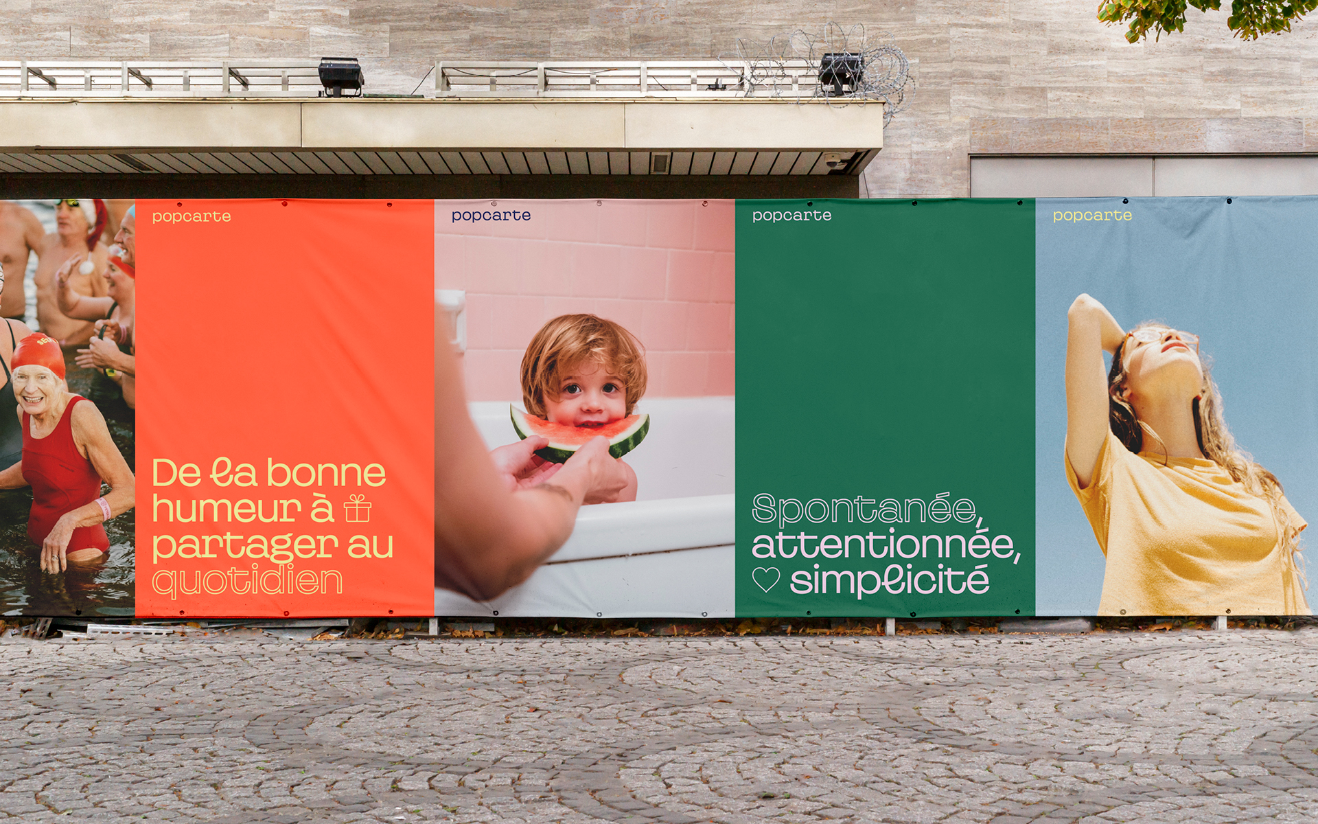
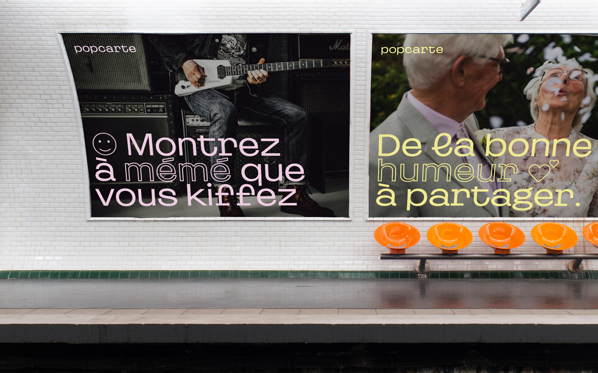
The Victoire font designed especially for the brand celebrates freedom of speech in all its glory: its unique calligraphy dips into fixed-pitch, slab serif and handwritten to create a sense of humanity, spontaneity, style and skill.


Victoire has its origins in the messages of old prospectus, promotional banners of stores in the 70’s and record sleeves. The shape of the letters is generously proportioned to assert Popcarte’s spontaneous and human identity, consistent with its activity.This has resulted in a typeface that is mostly sans serif, which appears large at first glance. The design also has a number of “humanistic” details, such as the lowercase “l”, the “t”, the ampersand or the number zero. A liveliness that avoids the effects of a typeface built too geometrically, too fixed.


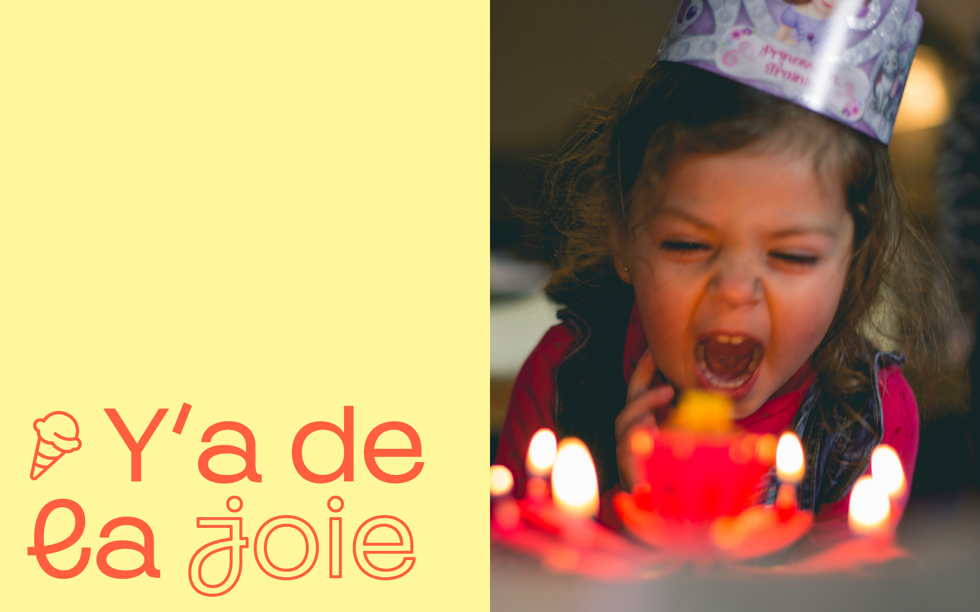
In short, Victoire’s typography is balanced, generous and imbued with the joyful character of the brand. Its typographic mechanics aim to give words and sentences a changing, dynamic and very personal visual rhythm, considering the infinite possibility of personalization that Popcarte offers.

Experiences, life moments, personalities can all be represented.


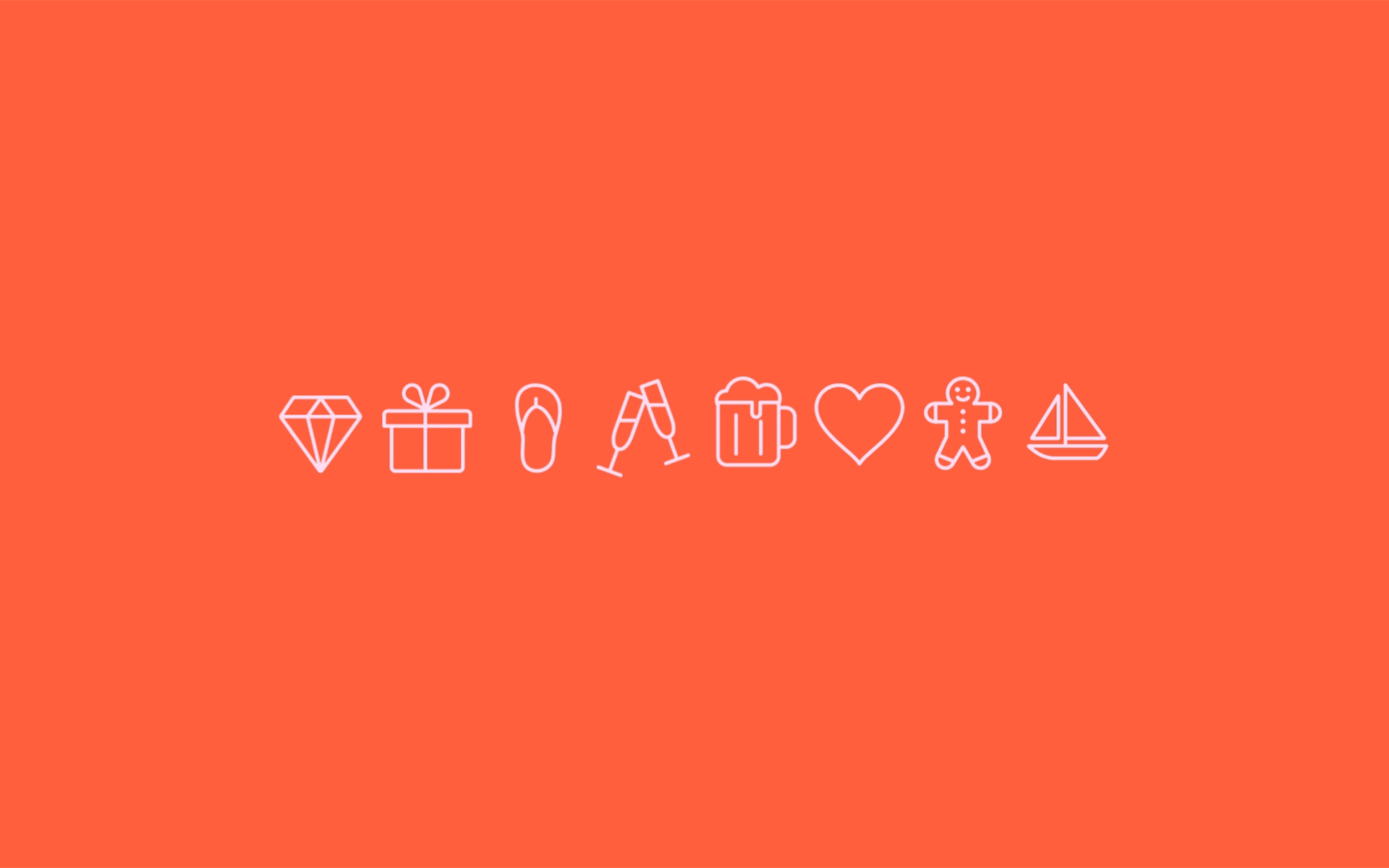
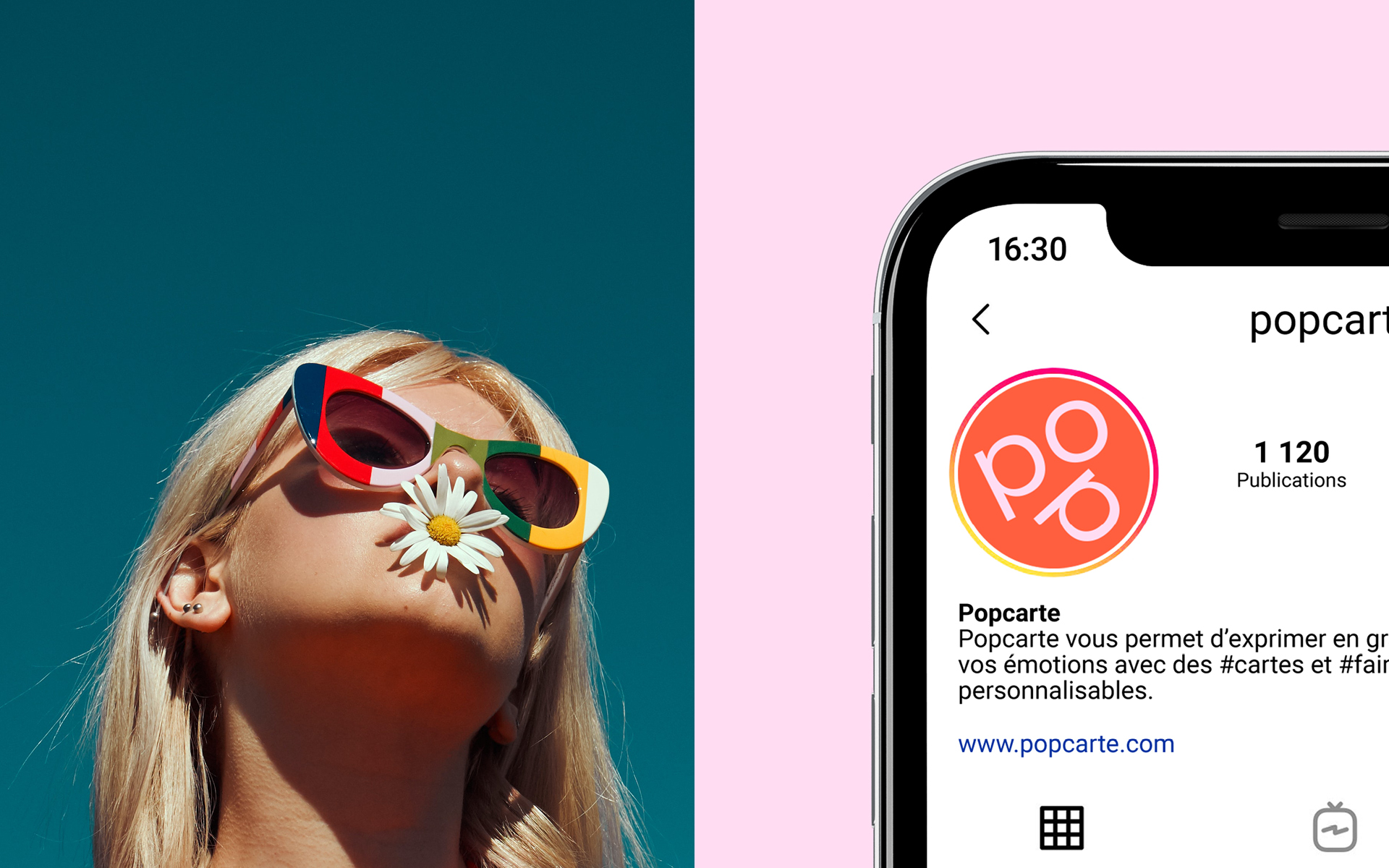
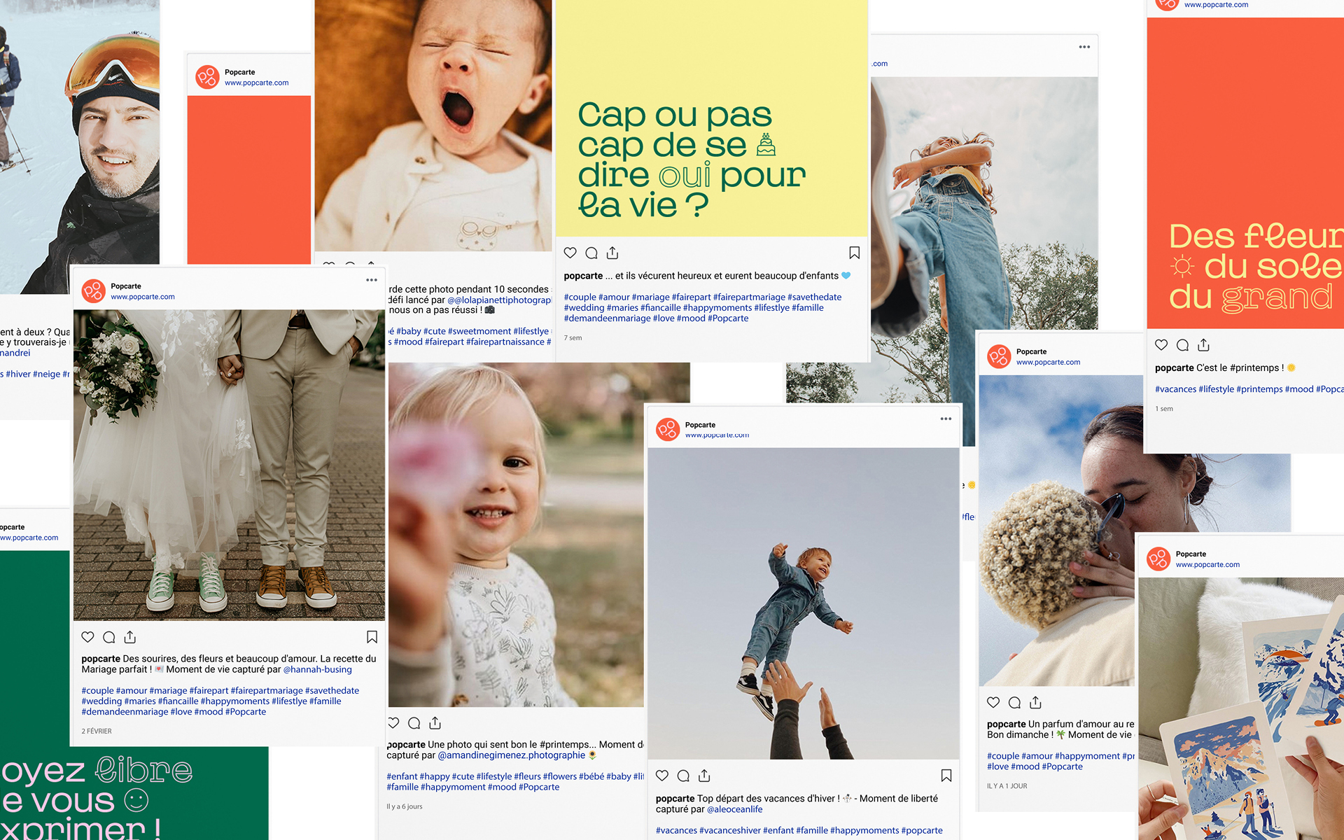
As each word can be considered a logotype in its own right, Victoire stands out for its use in all display configurations and sizes: in magazine headers, on posters or even in Instagram stories. Composed of several typographic versions (light, regular, outline), we enriched it with 9 “dingbat” weights, to echo the brand’s graphic system. Without dissociation of style, Popcarte integrates its own emojis in the heart of its messages.

A distinctive way to make typography easy to use and to embrace all the brand’s messages.

Be Dandy chose eight signature colours to embody the occasions that Popcarte celebrates.


The complementary, soft and vibrant hues come together to express every emotion no matter the occasion.


It brings the occasions to life with honest and bold iconography. Each photograph is flooded with natural light and captures a natural moment.

Related projects

Dietbon

stratégie branding logo monabanq

Monabanq