A proprietary design with Latin accents
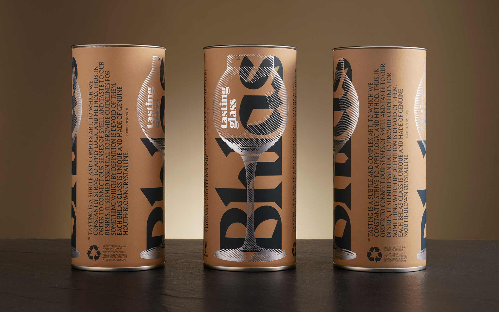
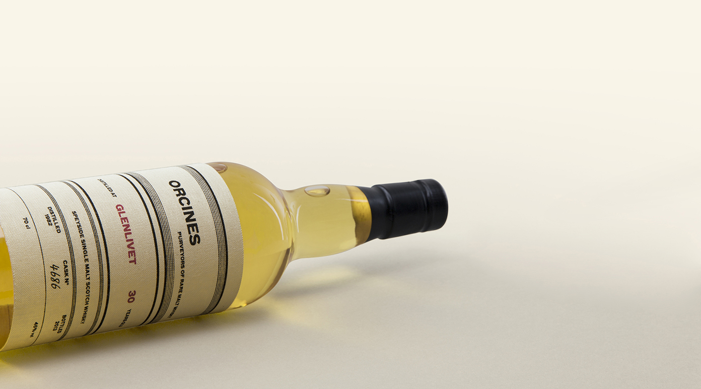
Be Dandy has materialised its presence by creating a case with a unique identity, drawing on the visual codes of the parent brand.
The brand is affirmed by the Harbour font, based on a contrast between the geometric bases of Latin typefaces and the calligraphic appearance of Germanic lettering. It confers power and tradition upon the word Bhlas, telling the story of its 40 years of know-how. This is complemented by the Blacker typeface, featuring a cuneiform serif, whose contemporary look harmoniously differentiates the function from the name.
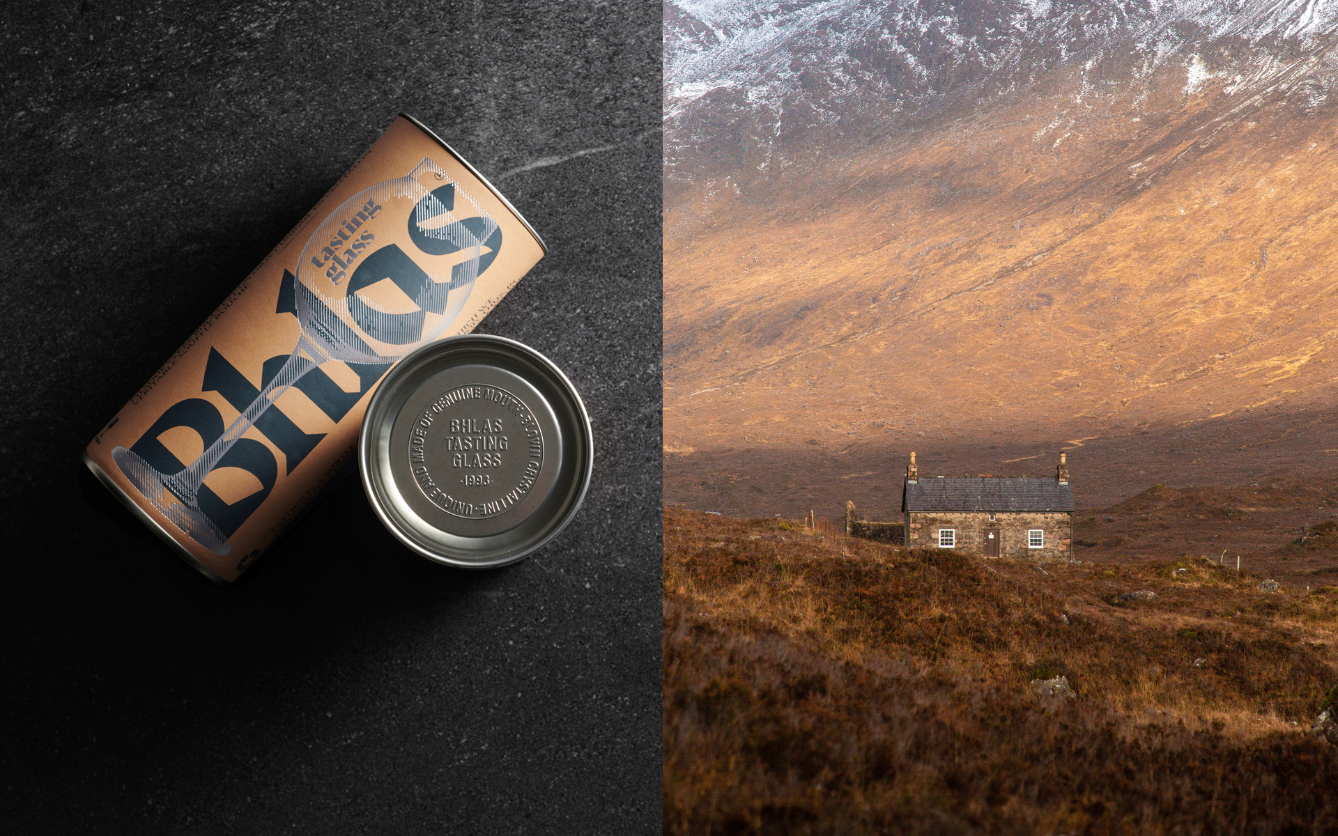
The packaging takes the form of a metallic cylindrical case covered with kraft paper, a protective container for an object that Be Dandy intended to be durable.
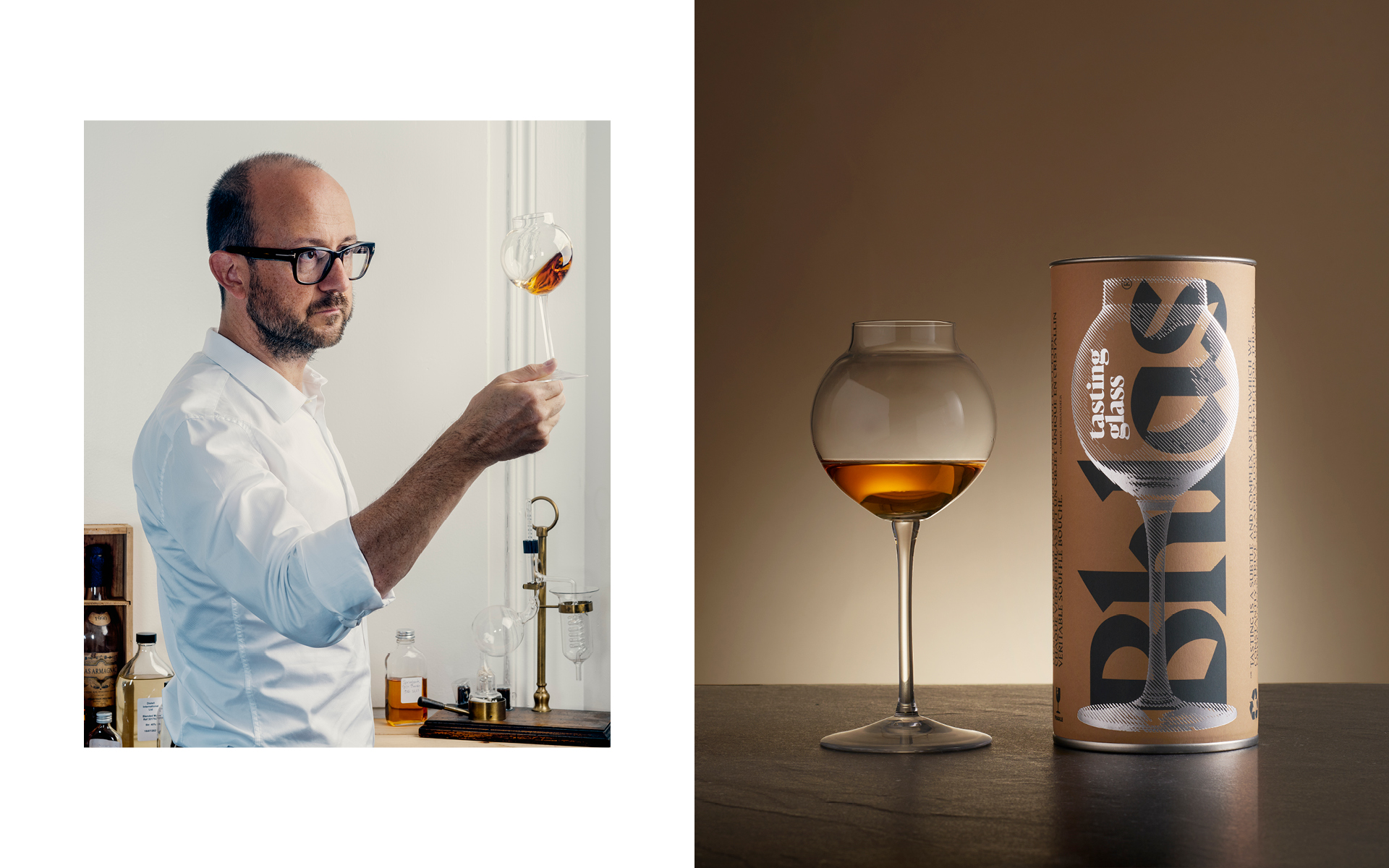
The word Bhlas running vertically up the side reveals its stature. In contrast, the hatched drawing of the glass on the case mimics its transparency. Sketched in sparkling silver, it brings to mind the reflections of the glass.
The rough beige of kraft paper conveys simplicity and local character, while the identity-affirming blue borrowed from the parent brand adds elegance and modernity. A choice suggesting humility and passion to accompany this one-of-a-kind object on the connoisseur’s table.
