Take people where [1] they've never been
Does your brand express the dreams [2] within you?

“A unique design that stands out from the crowd boosted by strong branding. They address each subject with a brand vision, they sometimes take us out of our comfort zone but the results are always very positive and consistent.”


Arnaud Duhem CEO and founder

Client

Les Petits Parisiens

Missions

Strategy
Branding
Interior design

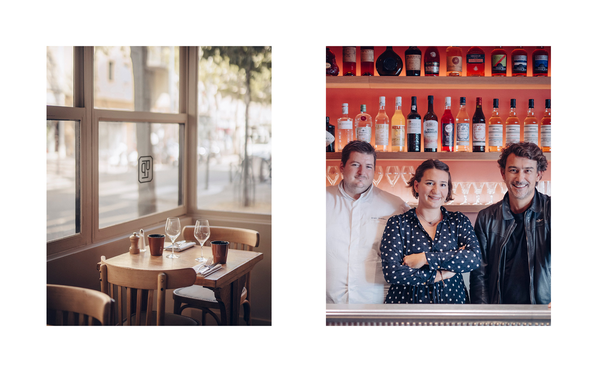
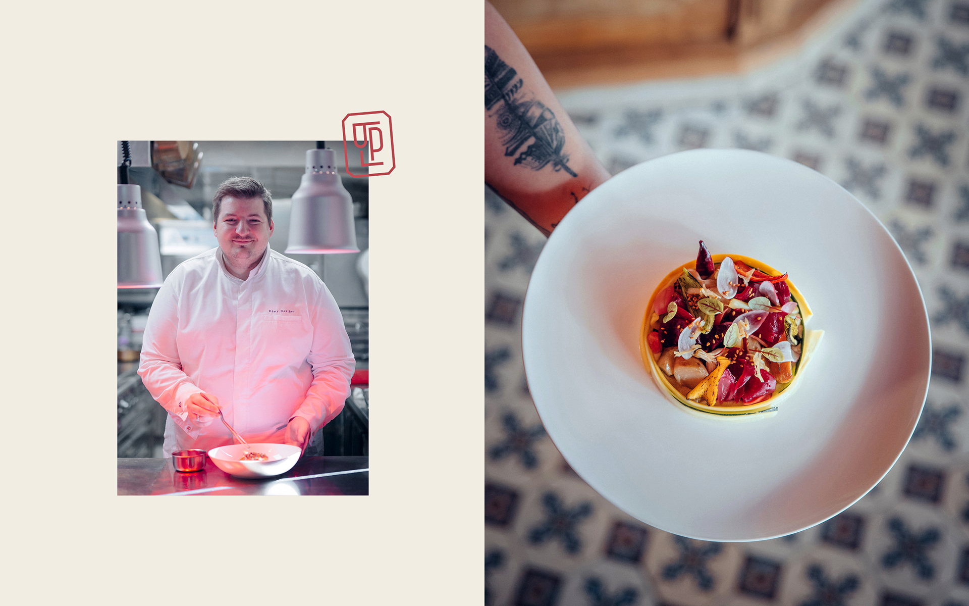
After the success of his first restaurant, Les Petits Princes in Suresnes, Arnaud Duhem is laying the table again with his chef Remy Dantez. He chose the Be Dandy agency for the graphic and architectural design of his new restaurant Les Petits Parisiens, in the 14th arrondissement in Paris.

When two worlds of pleasure and chic dining meet


When Arnaud Duhem decided to set up shop on the former site of Régalade, he inherited a whole era of bistronomy’s history. In fact, his chef Remy Dantez started out at that legendary restaurant. A question then arose: how could he establish his own universe while maintaining continuity with that of the old bistro?


Making something new out of something not so old


The architecture and identity of Les Petits Parisiens are full of references. For Pierre Berget, Creative Director at the Be Dandy agency, it was essential to add a new twist to the bistro imaginary attached to the place in order to reconnect it to the style of Les Petits Parisiens, Arnaud and Remy, of which Les Petits Princes was the manifesto.
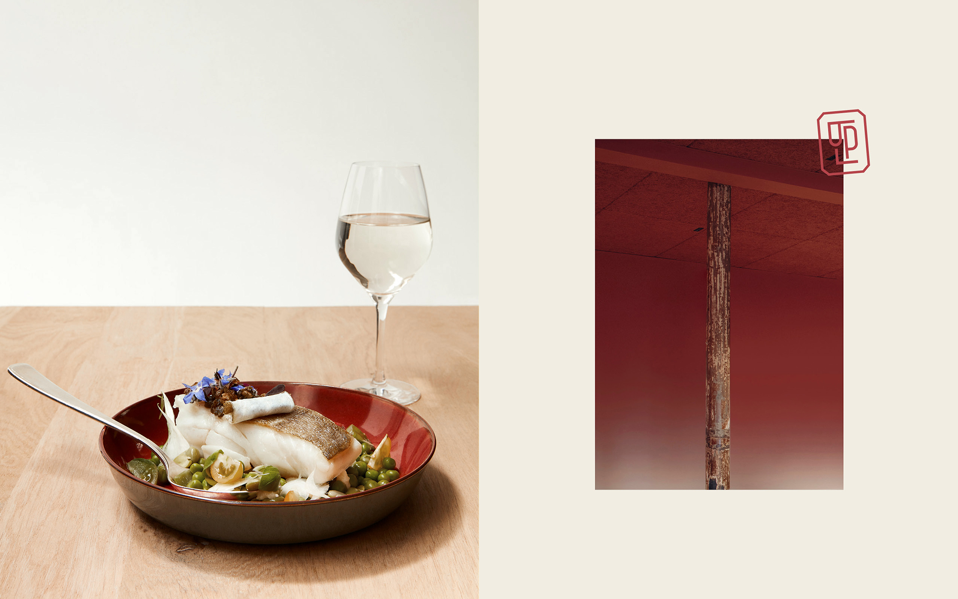
The visual identity reinterprets the typically Parisian graphic universe of the 30s/50s, the golden age of the bistro. The Zurich typeface chosen for the logo was inspired by the old posters and signs of the capital. The more functional Sweet typeface is used for informative text, formulated to evoke the Parisian slang of the time. Designed as a signature, the LPP monogram appears on the stationery and gives the place a recognisable identity, concentrated in a sign.

Window on the kitchen: a showcase dedicated to the pleasure of eating well


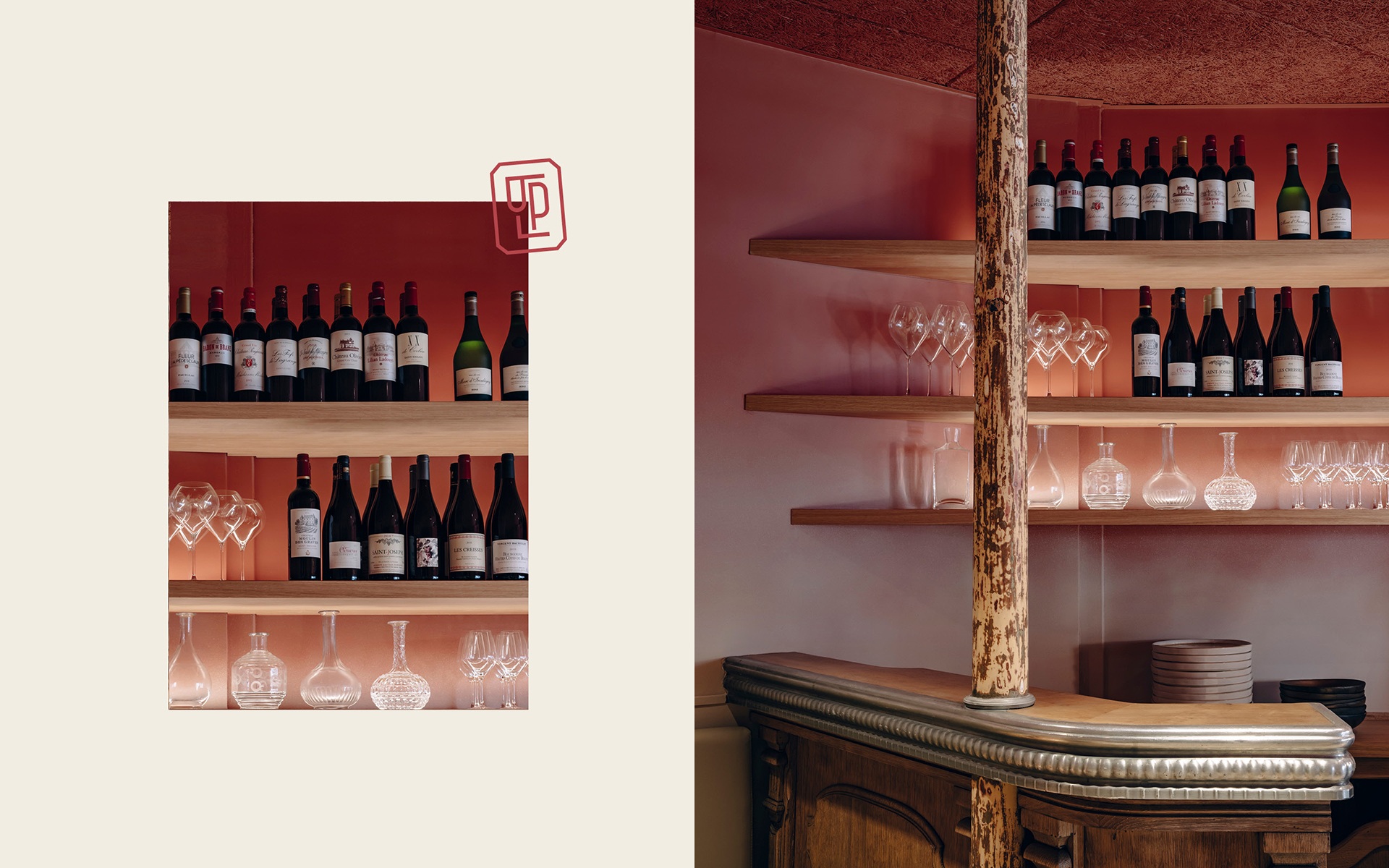
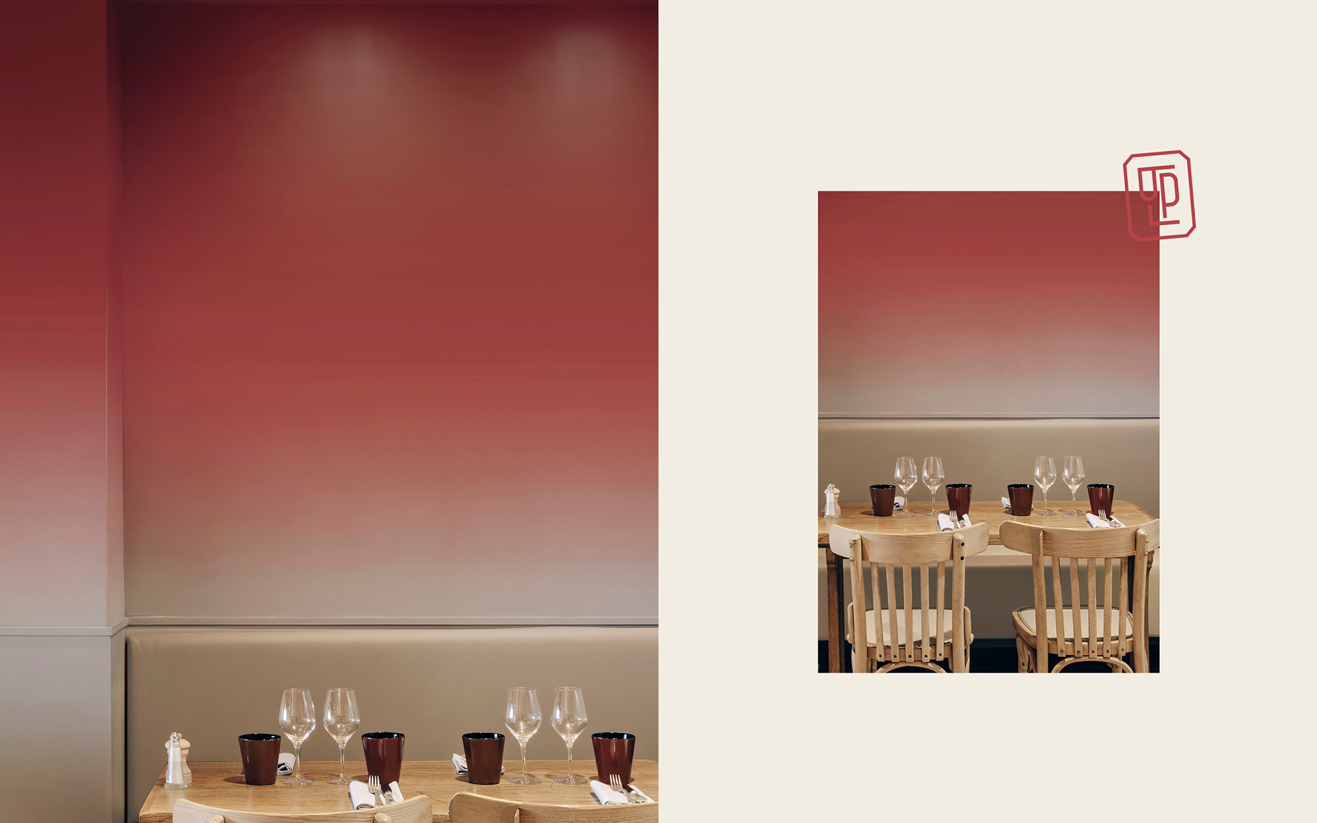
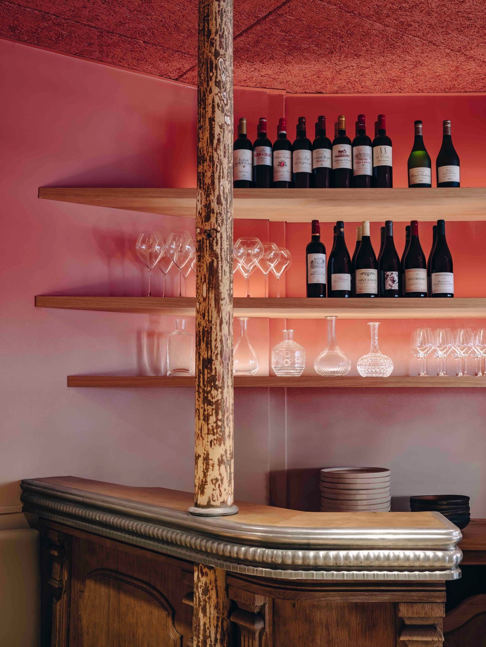
Sober and warm are two words that guided the agency when designing the restaurant’s architecture. Transforming the small size of the place into a factor of rarity and proximity, the Be Dandy agency conceived the space as a showcase. An immersive volume whose layout creates a break between outside and inside space. In the evening, the black façade blends in with the darkness and opens like a secret window onto the theatre of the restaurant. The walls are painted in shades terracotta, a derivative of the red colour so typical of bistros. They illuminate the place with a modernist aura while the lower areas are more restful. When seated, the top priority is what’s happening on the plate. The furniture is vintage and sanded down, in fawn shades that tastefully complement the original floral tiles. These light colours counterbalance the effervescence of the glowing upper areas and the zinc counter. A subtle contrast, just like the restaurant’s cuisine, sober and generous, refined but without fuss.
A contemporary celebration of French Bistro


Coming from a typical old Parisian bistro we reinterpreted the myth to create a hearty yet refined atmosphere.
Sourced from vintage markets and local artisans, the traditional furniture have been revamped with a contemporary finish.
The terra-cotta gradient on the walls bring a more subtle and soft touch to the historical butcher-red of checkered tablecloths.
Bringing balance and volume to a small space Be Dandy also capitalized on its intimacy to lay more emphasis on the plate, thus celebrating the most exiting part of bistronomie: the pleasure of food.

Related projects

La Cale

Orcines

H.THEORIA