“Be Dandy demonstrated creativity and daring in the creative proposals they pitched us and we loved it!”
Shaun Nelson Founder of Keeze
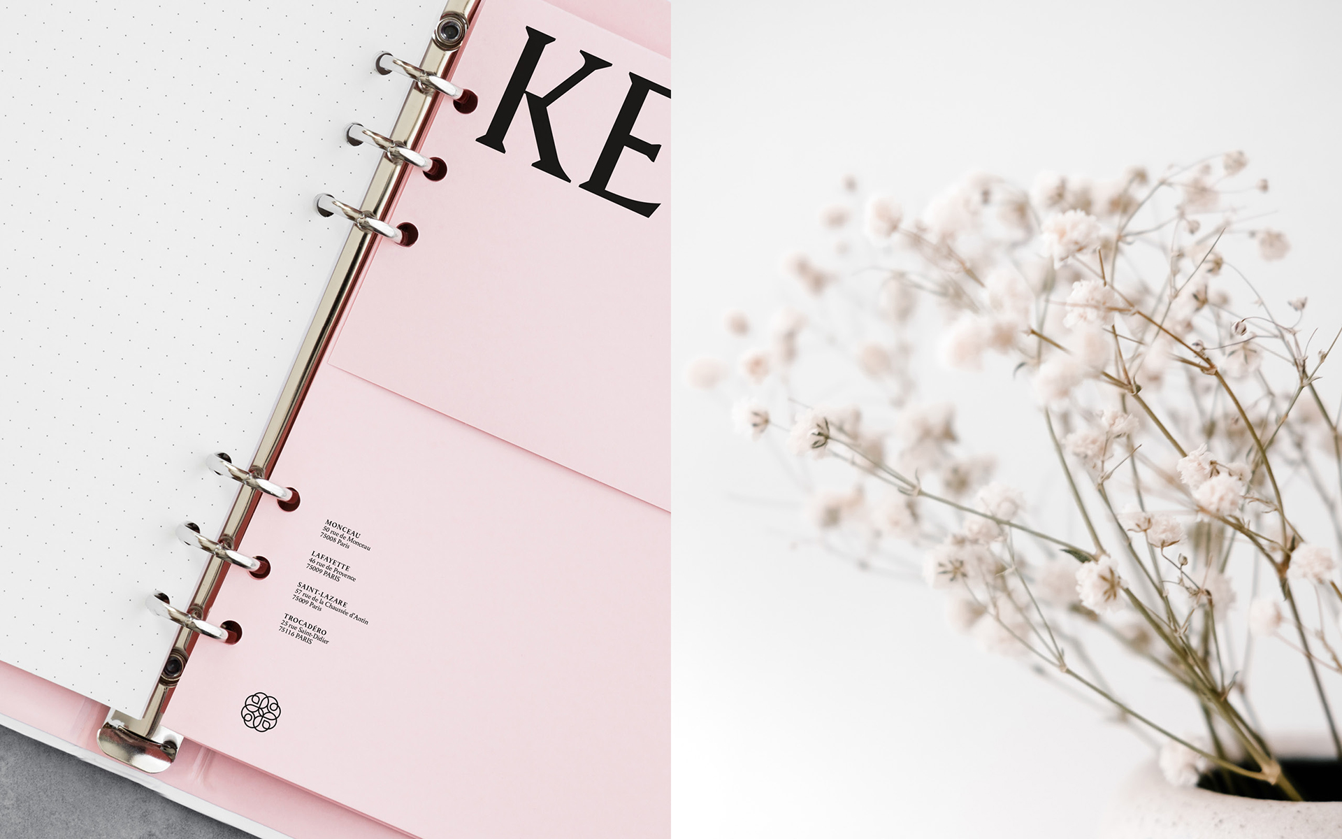
Client
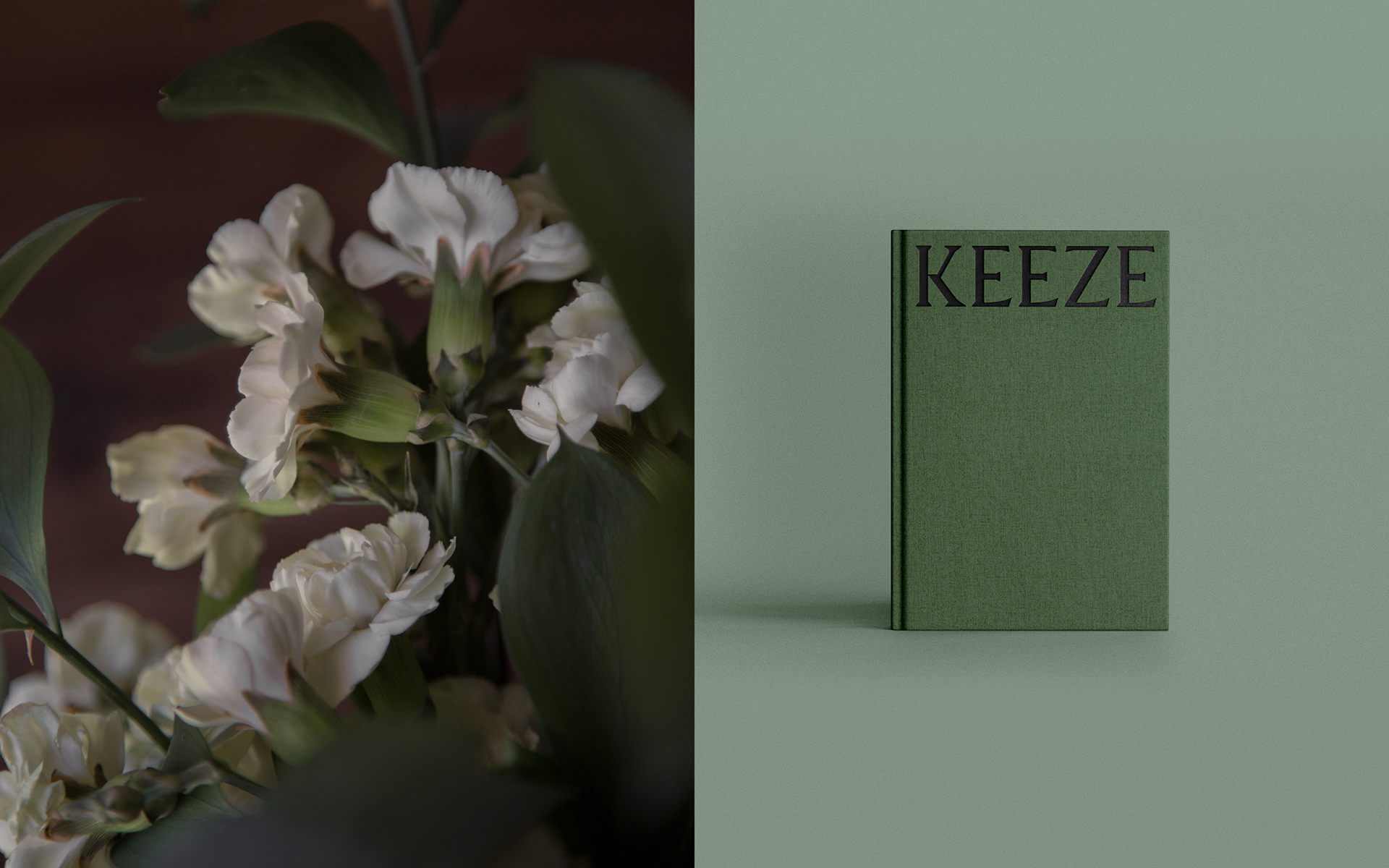
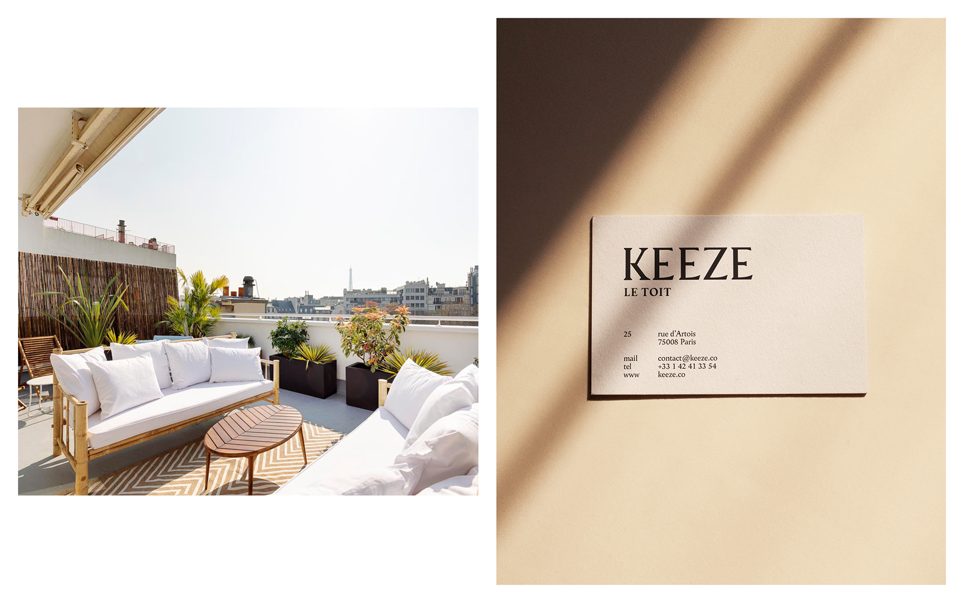
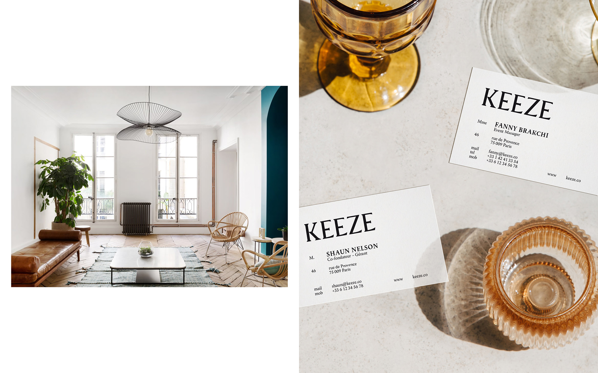
Keeze
Missions
Brand strategy
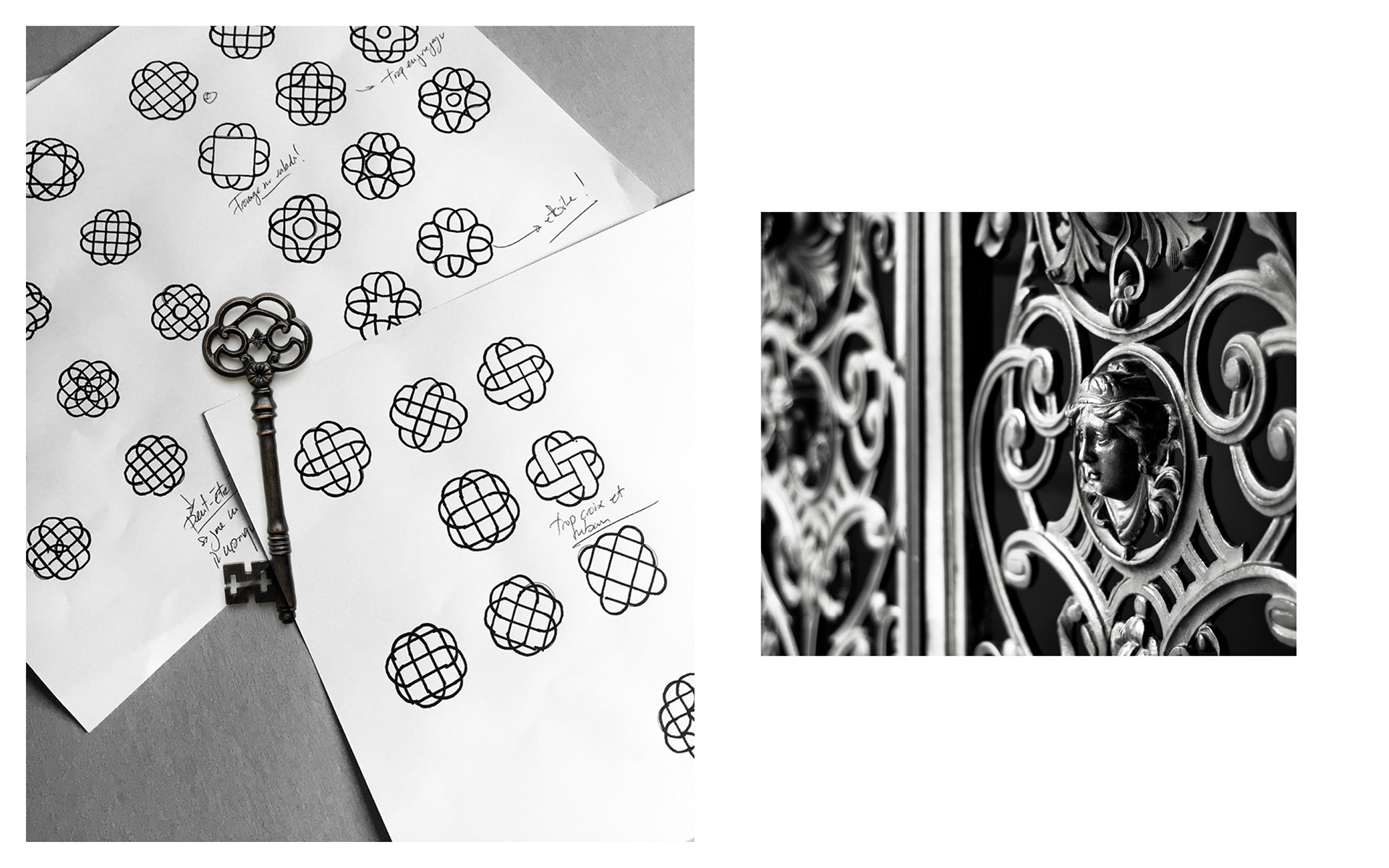
Branding
Activation
Take people where [1] they've never been
Does your brand express the dreams [2] within you?
“Be Dandy demonstrated creativity and daring in the creative proposals they pitched us and we loved it!”
Client
Keeze
Missions
Brand strategy
Branding
Activation


Related projects
Nest
10 year anniversary Novaxia
MU architecture